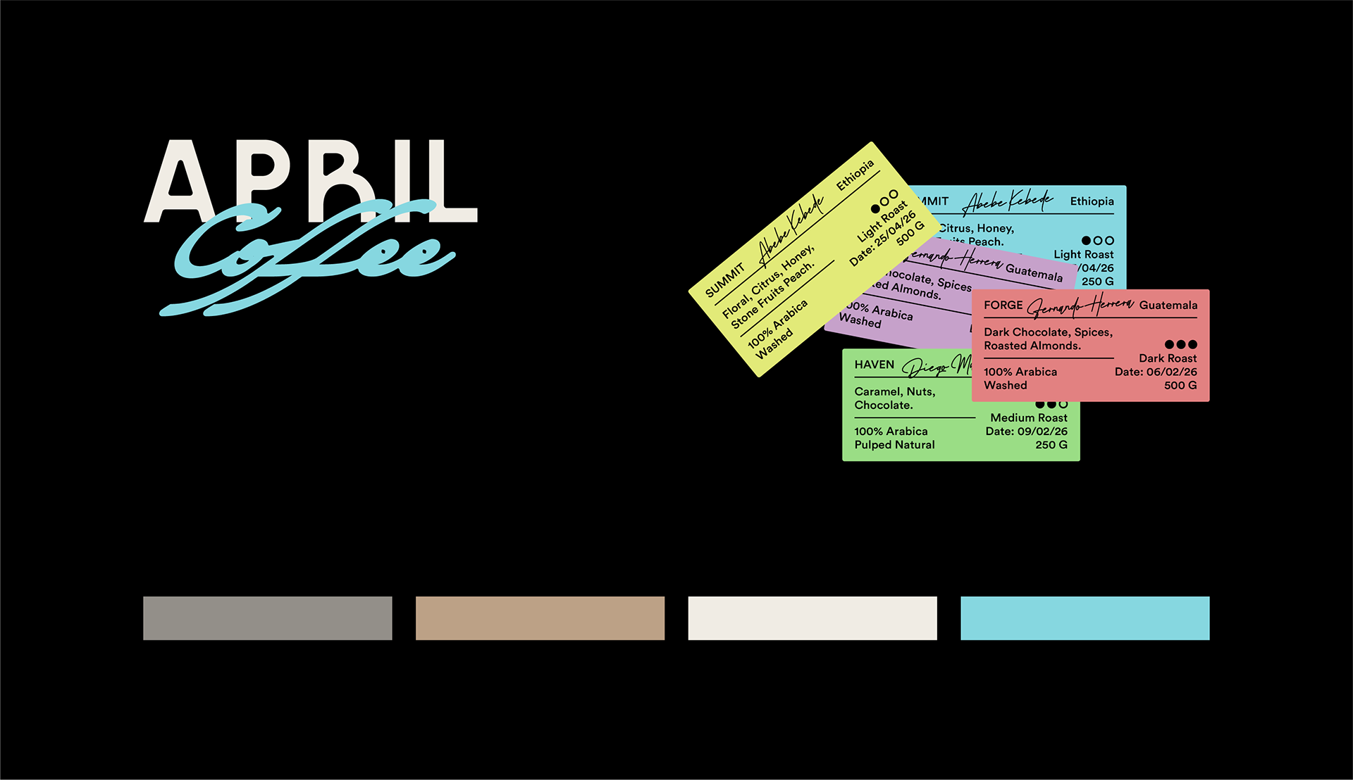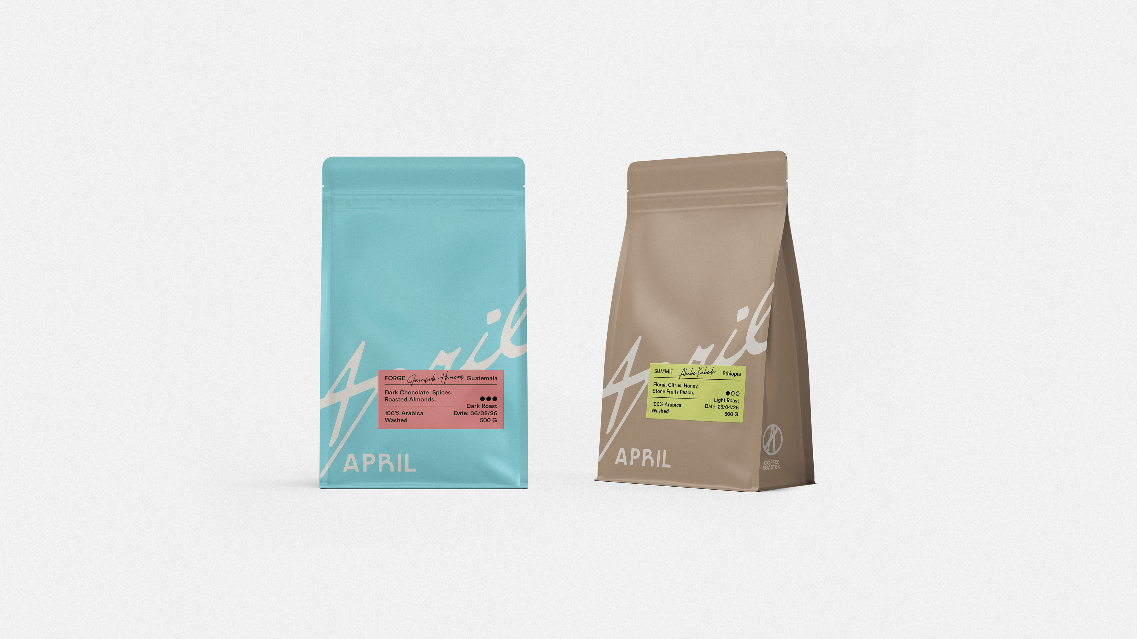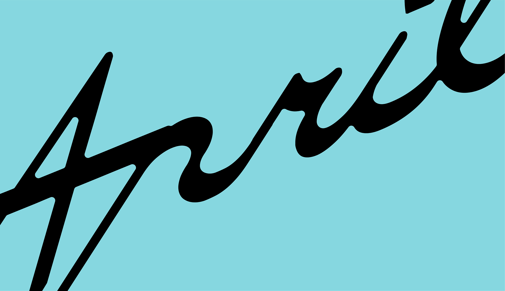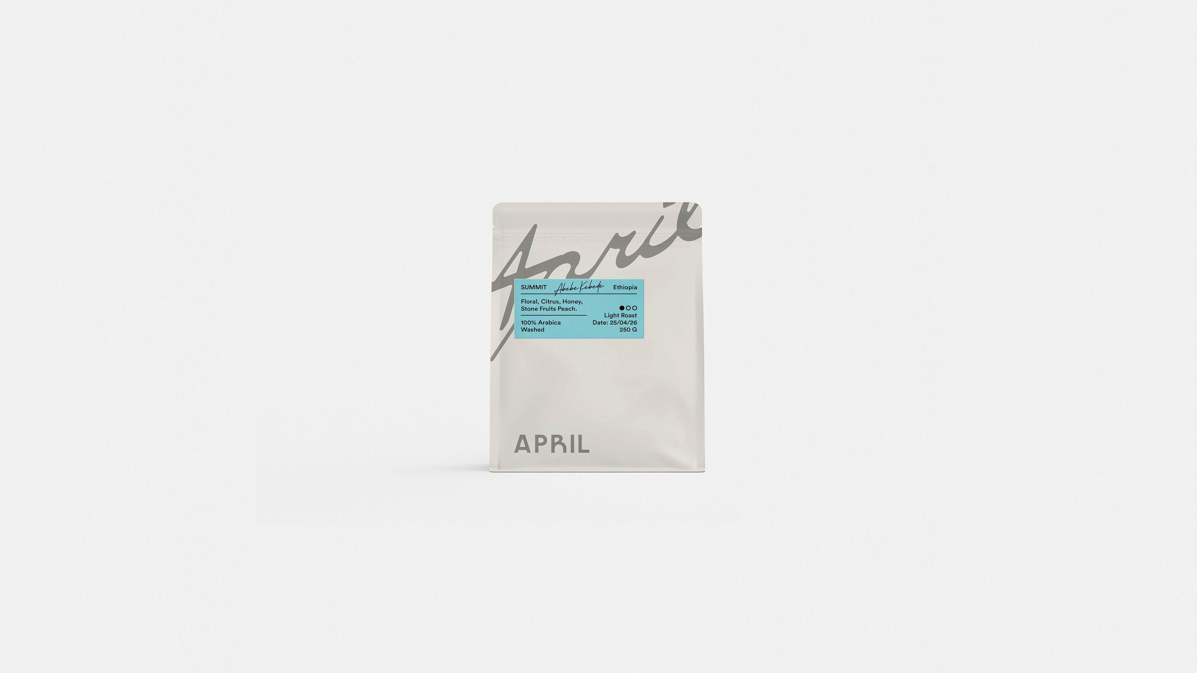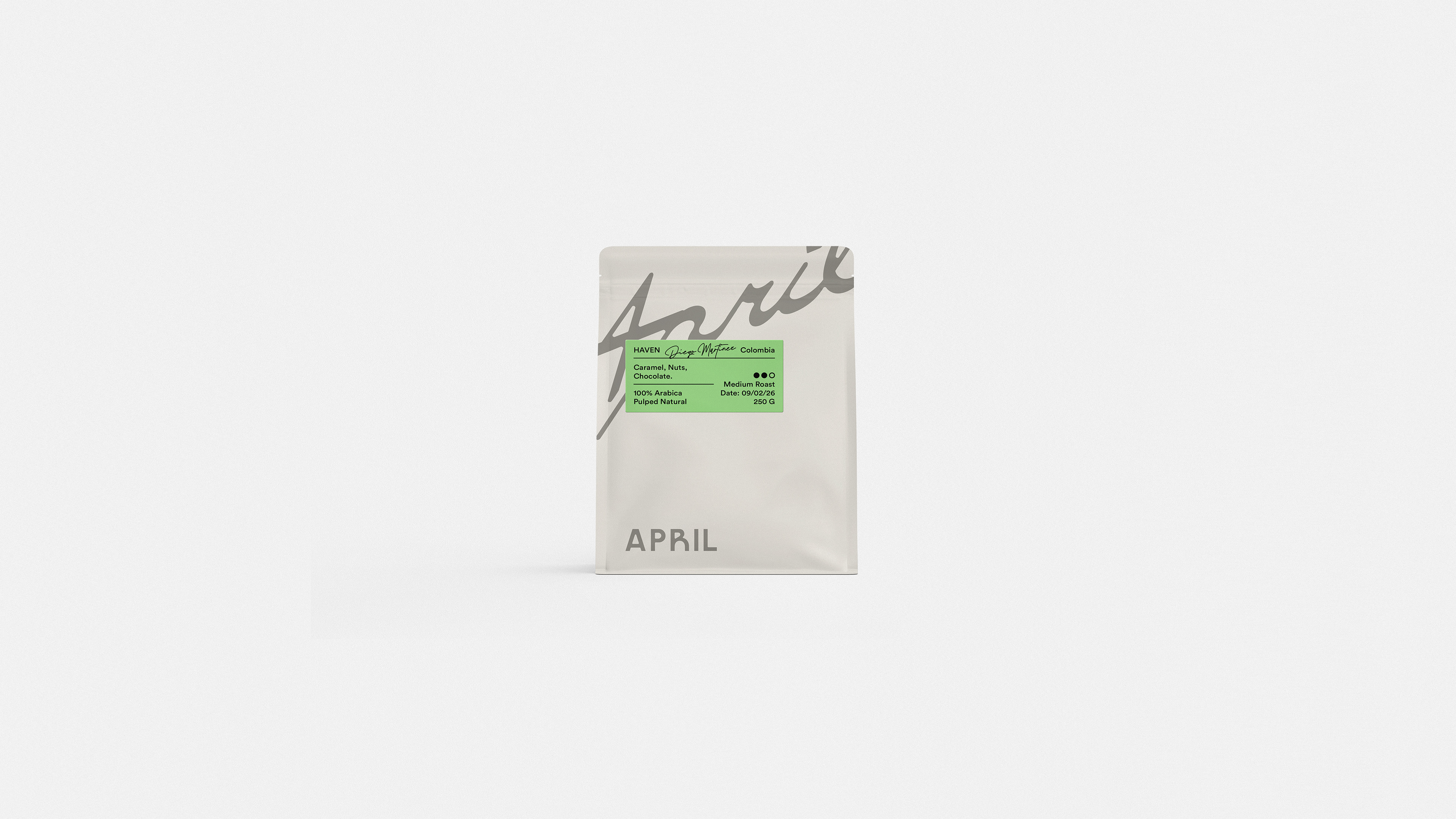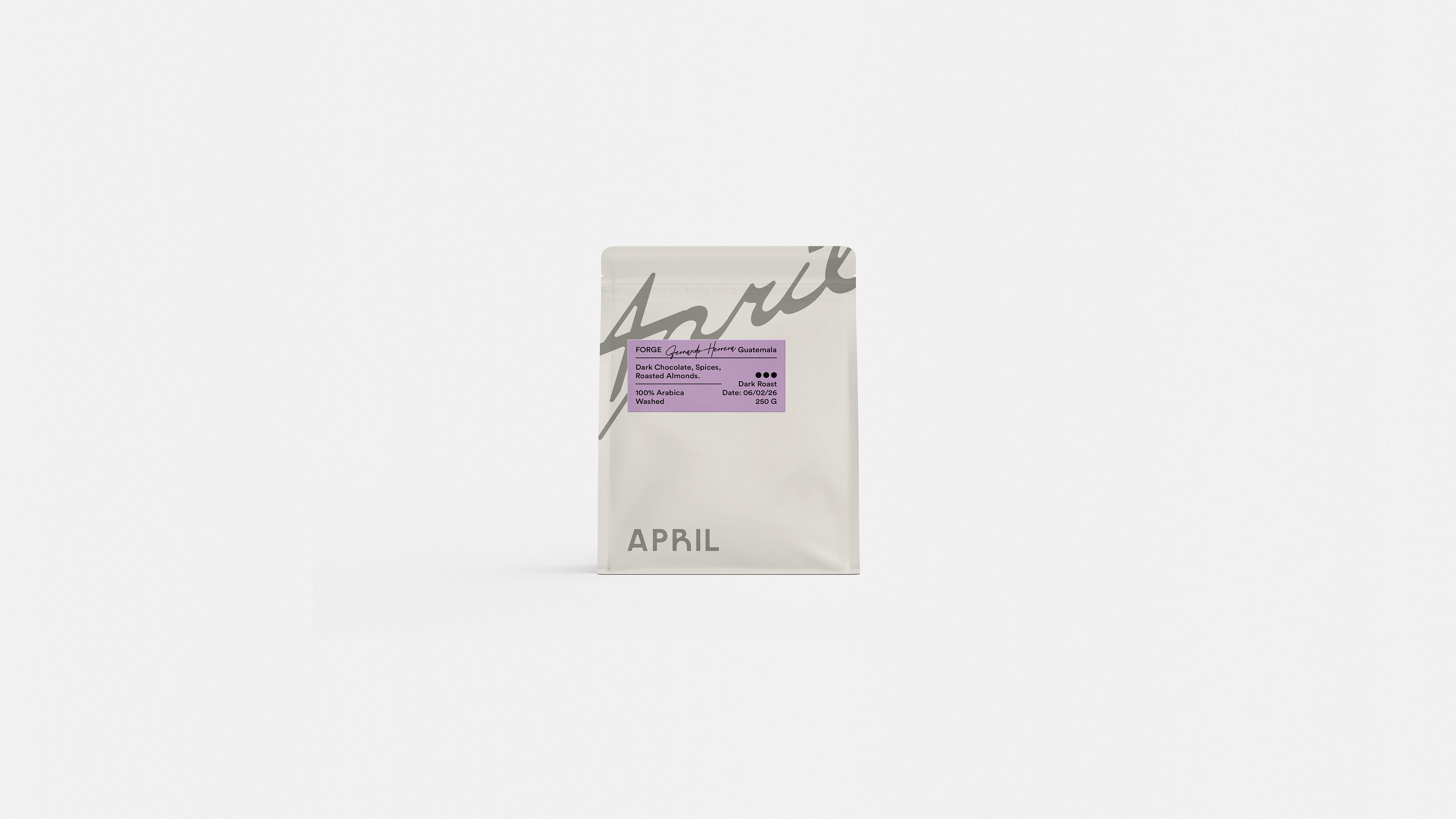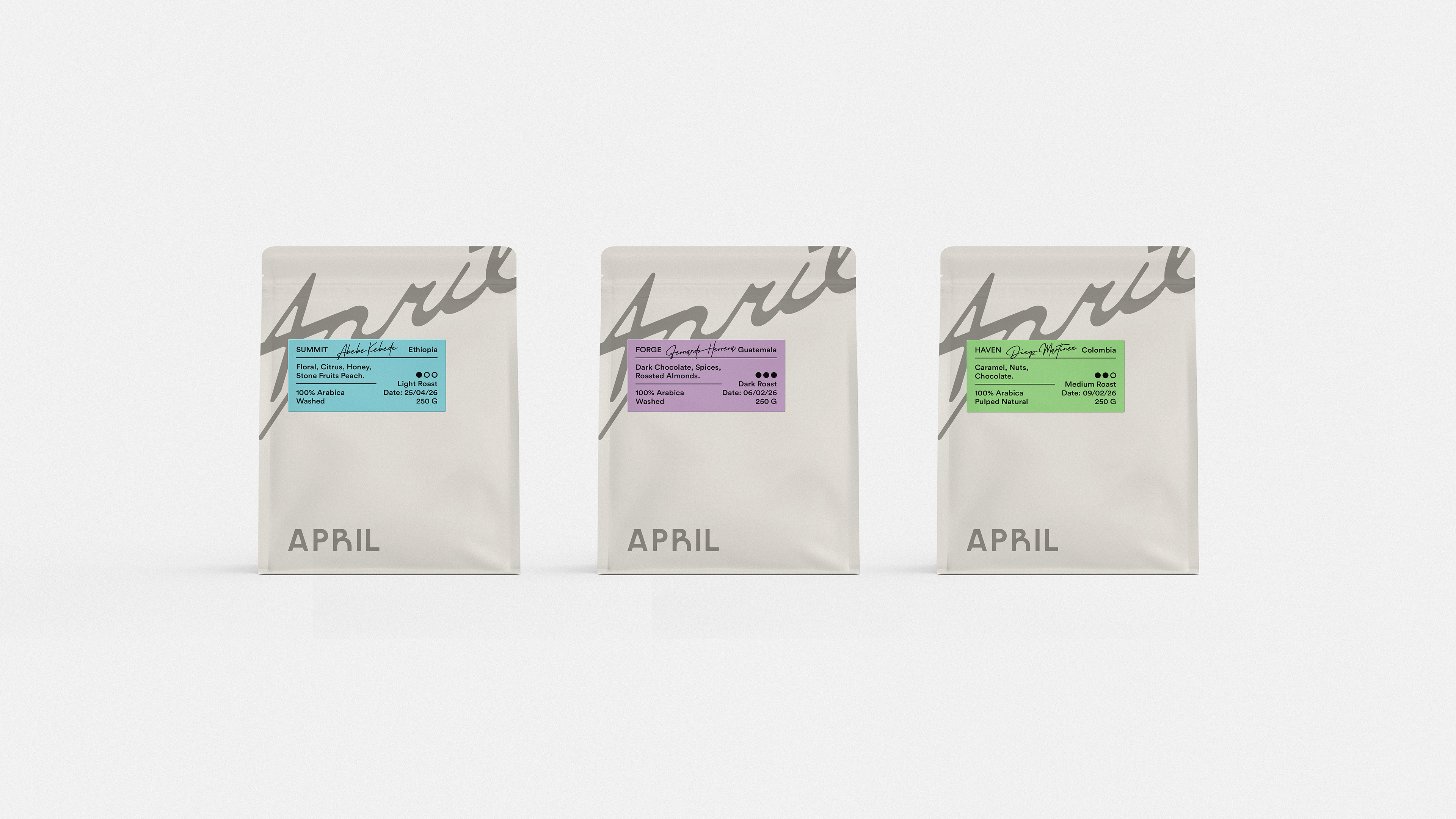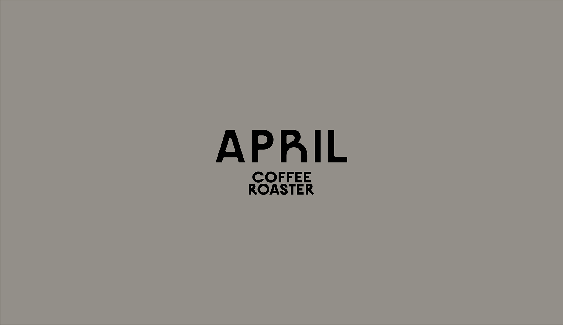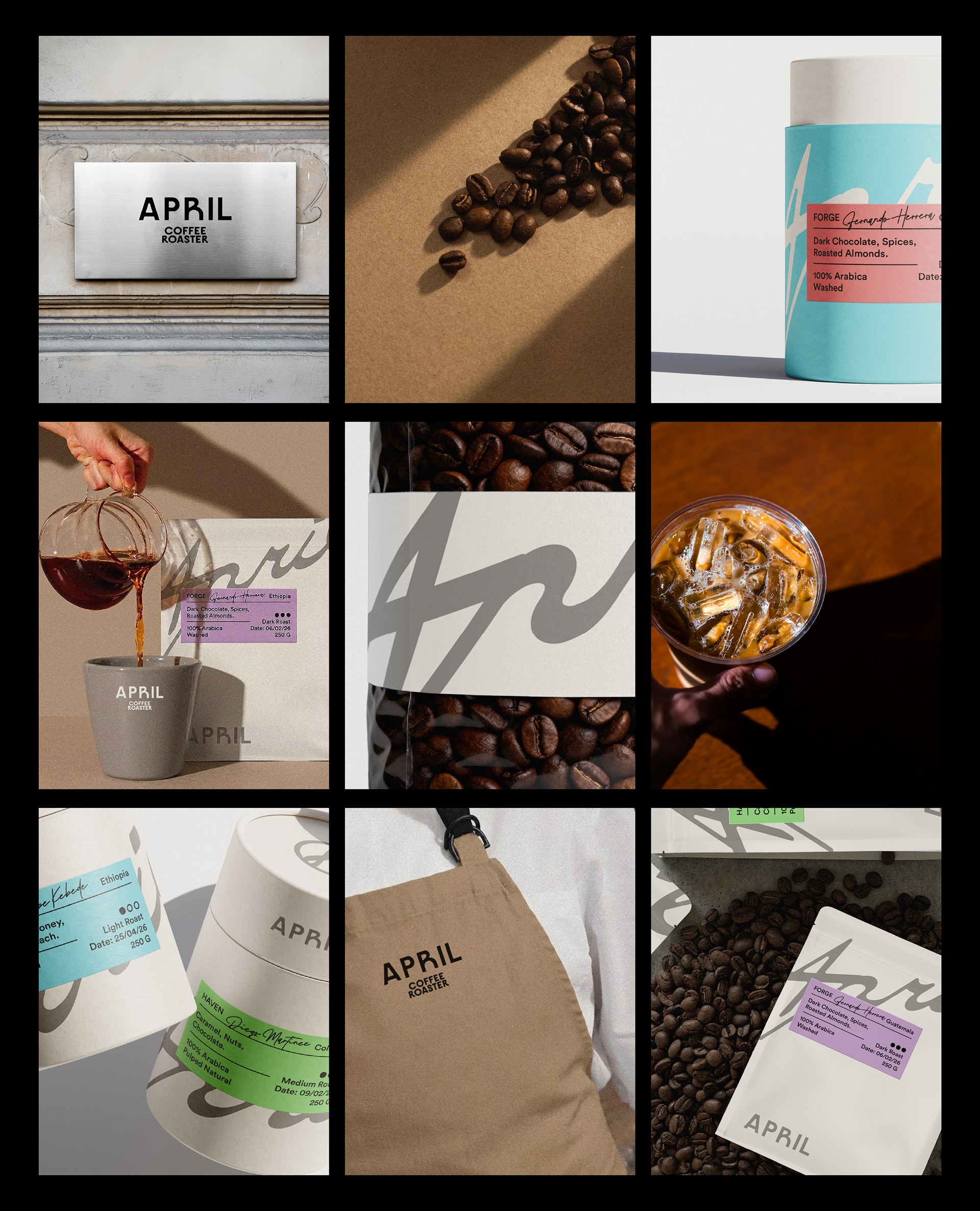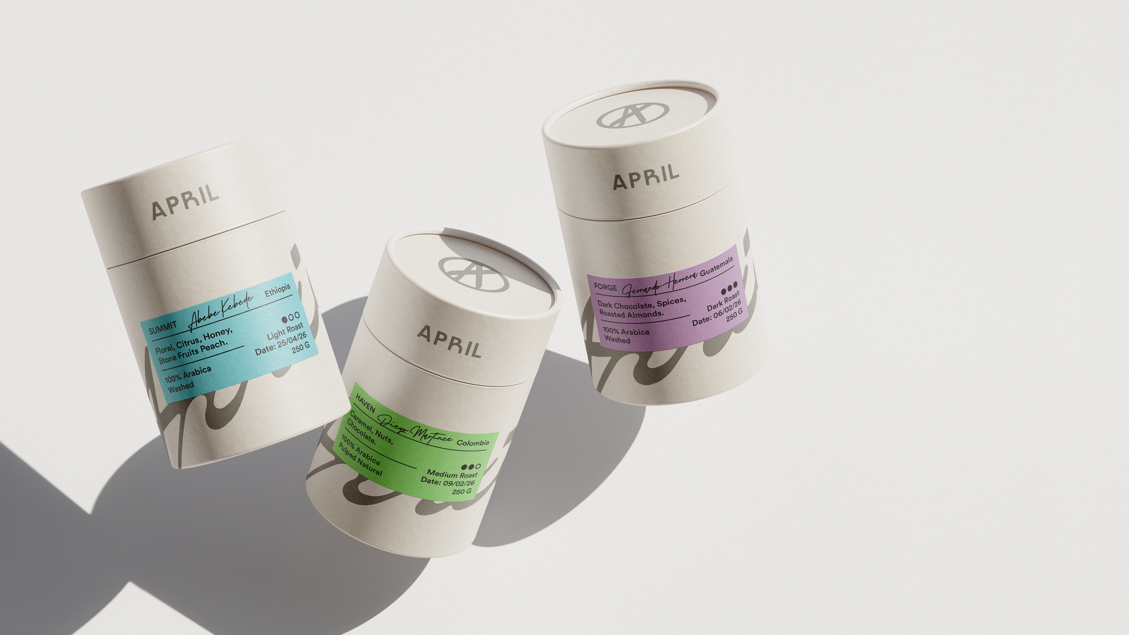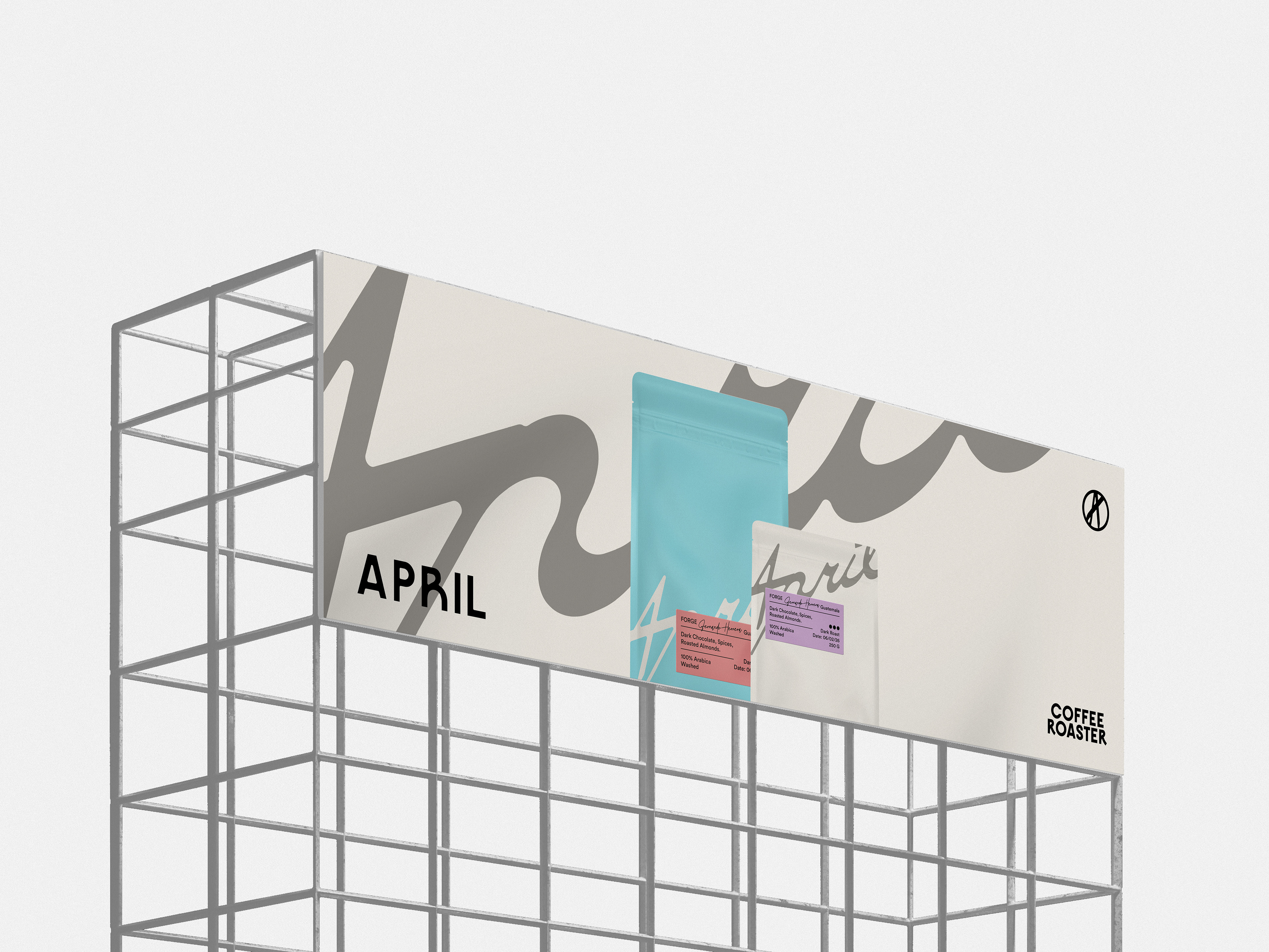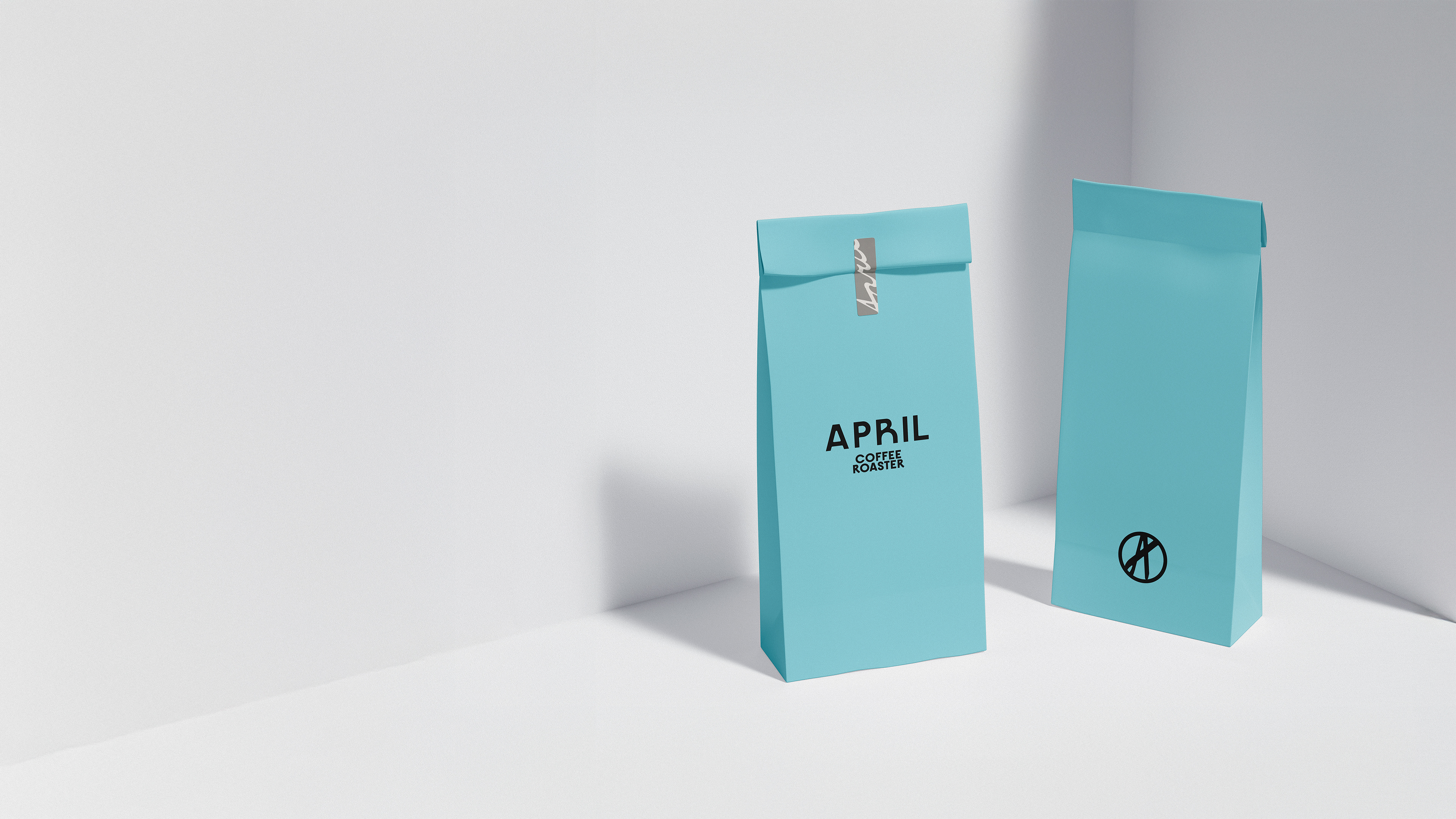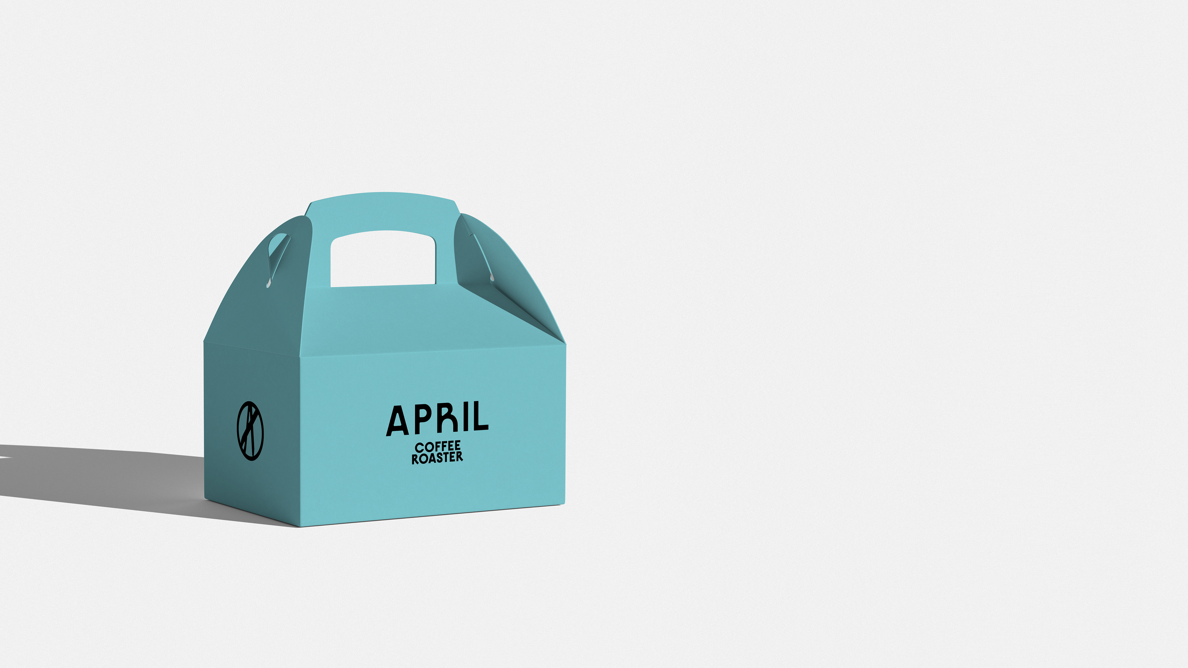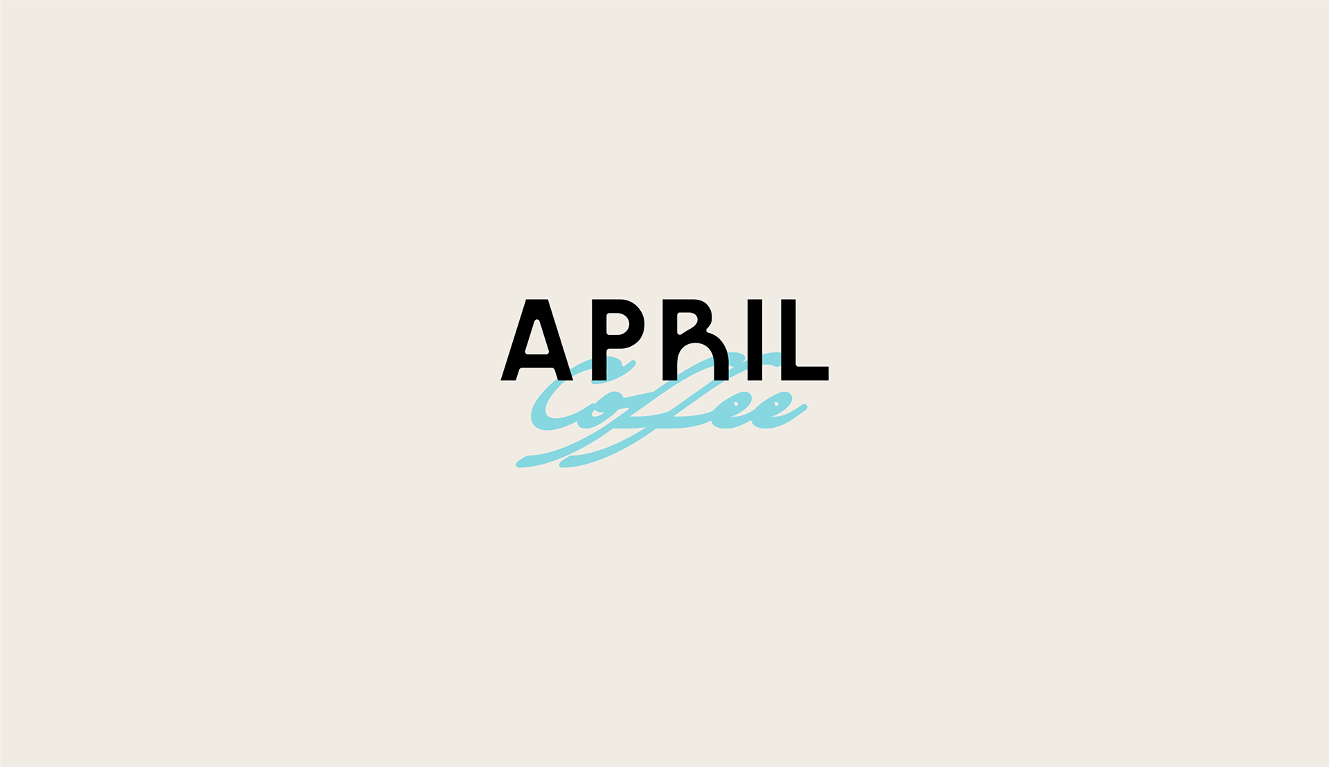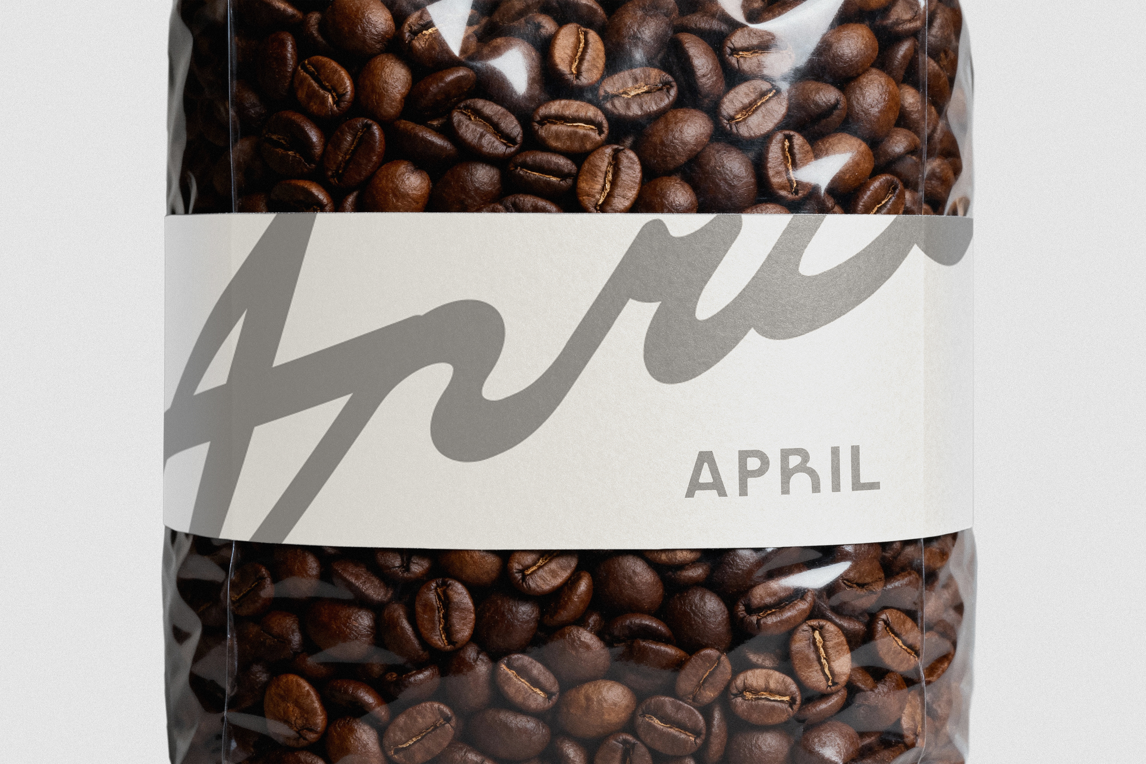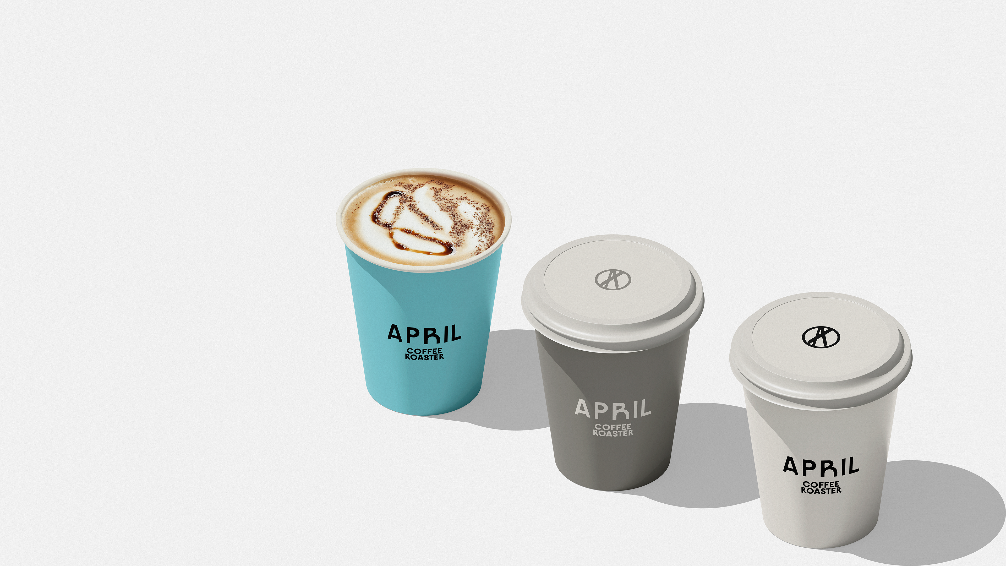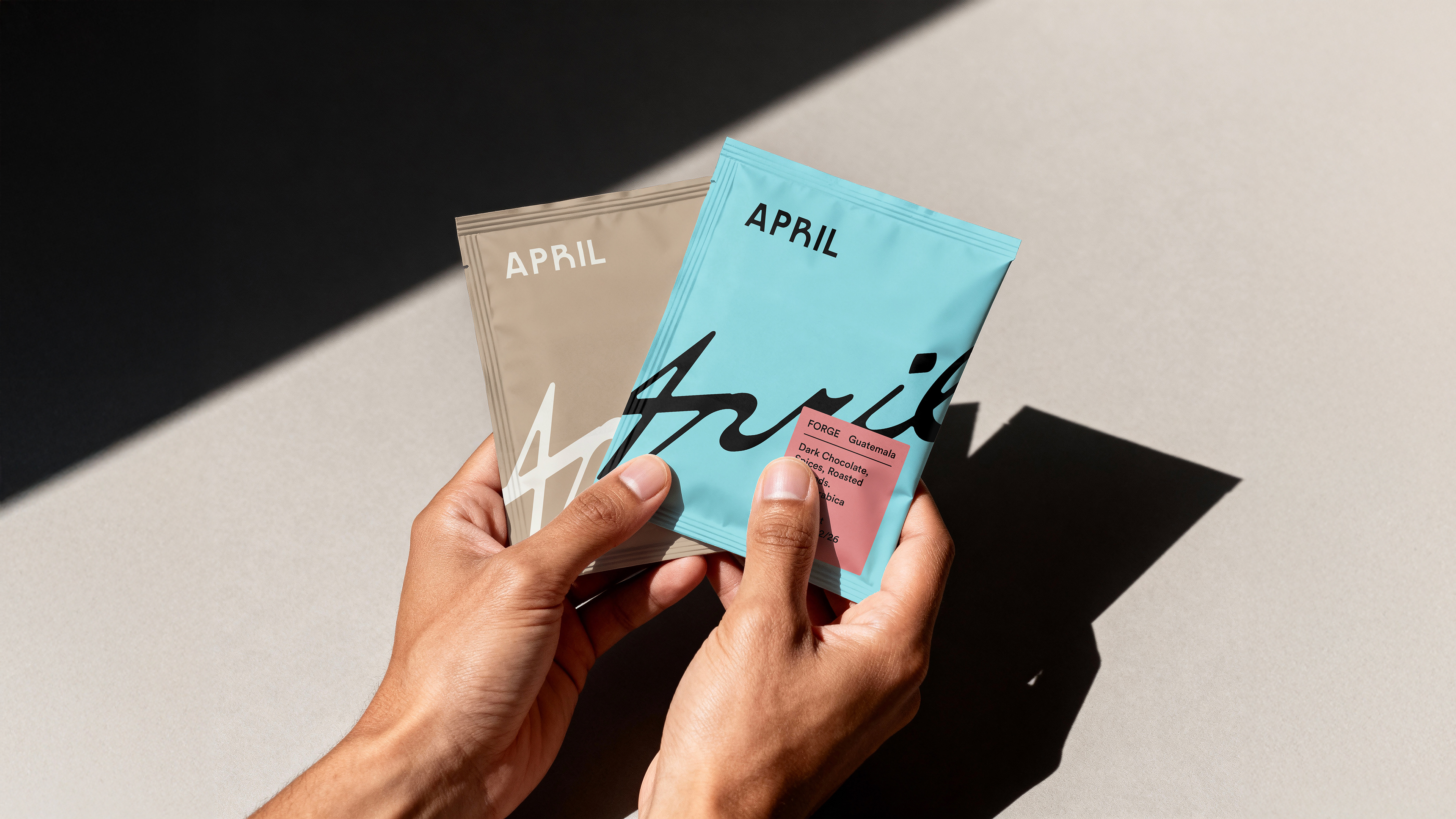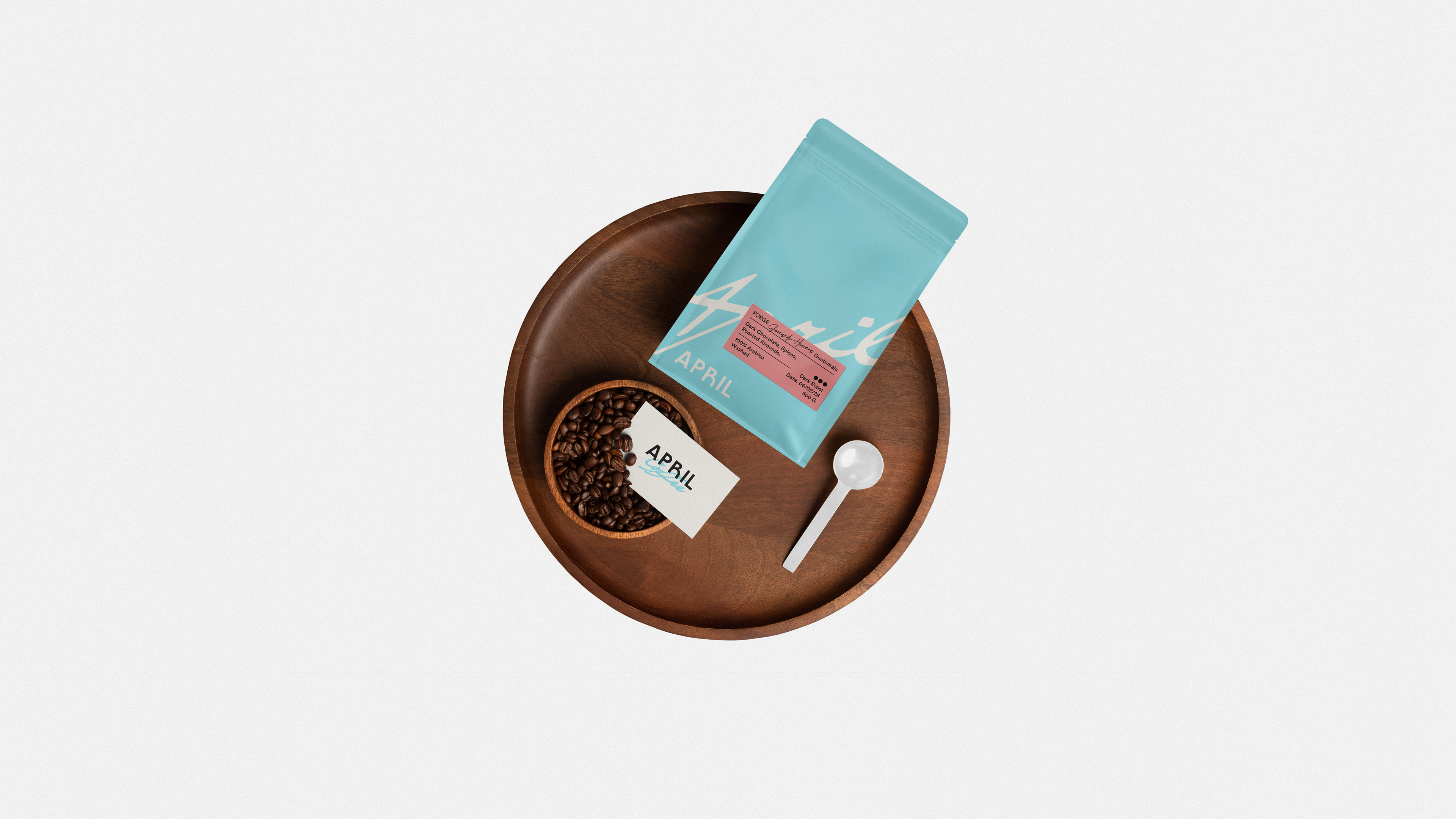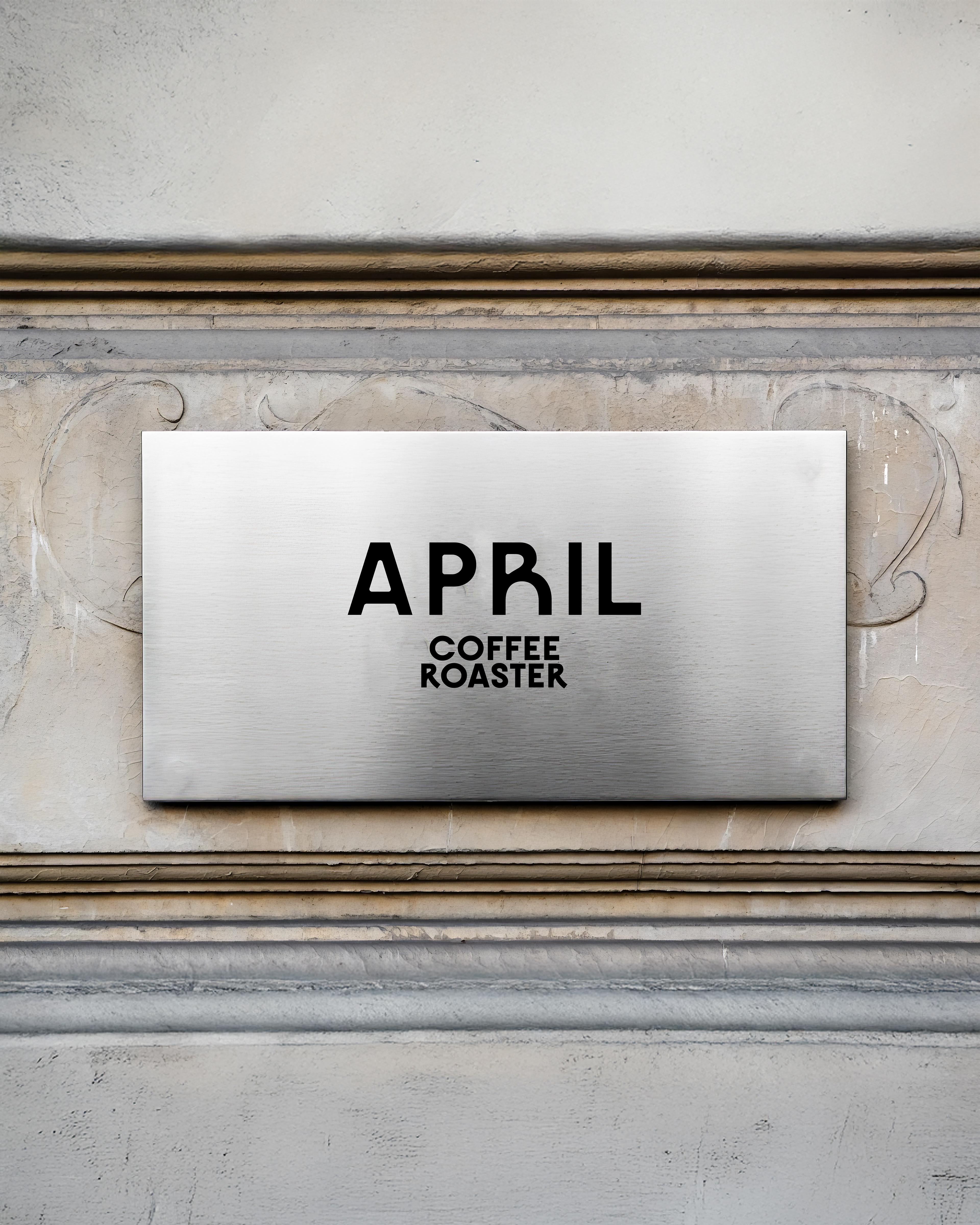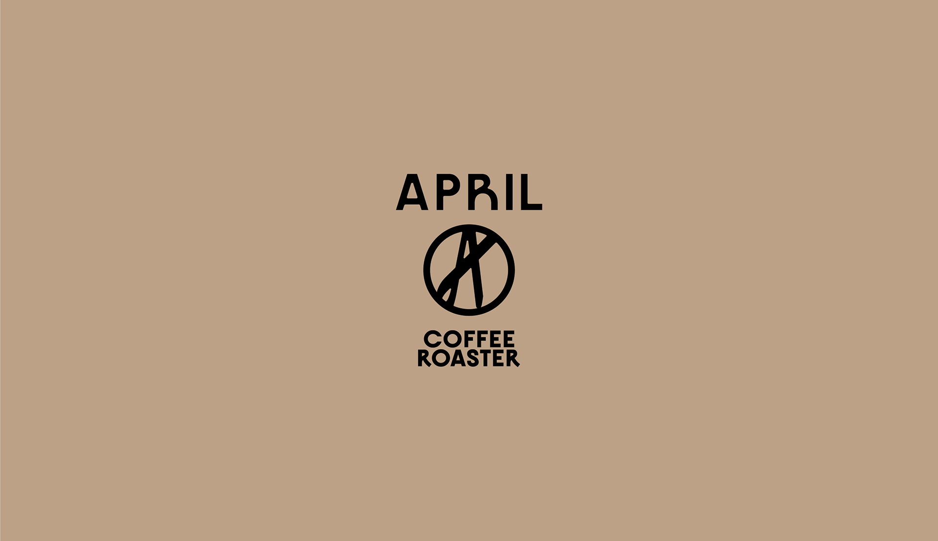
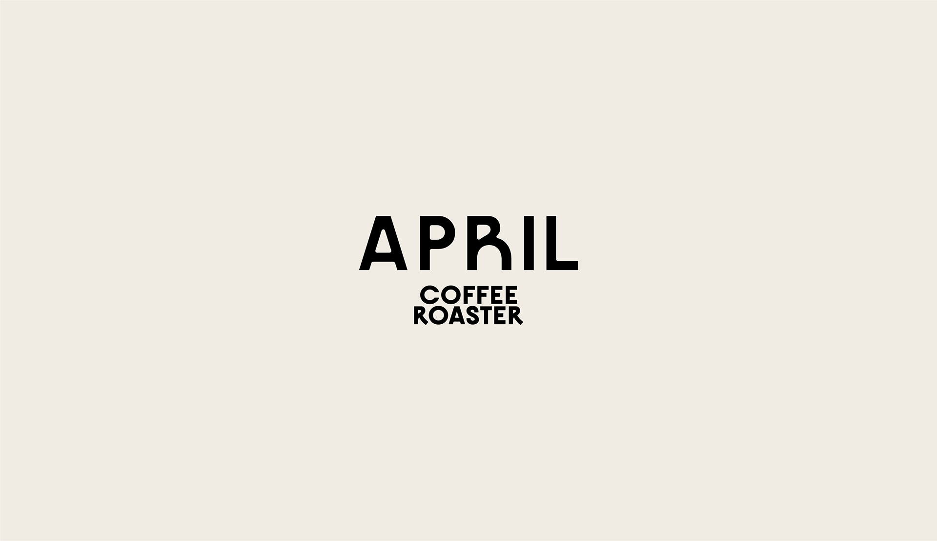
April is a specialty coffee roastery defined by simplicity, precision, and thoughtful design. The identity embraces a minimalist approach, combining a clean sans-serif logotype with a handwritten signature that adds warmth and personality. Completing the system is a distinctive symbol inspired by the letter "A", creating a flexible and instantly recognizable brand.
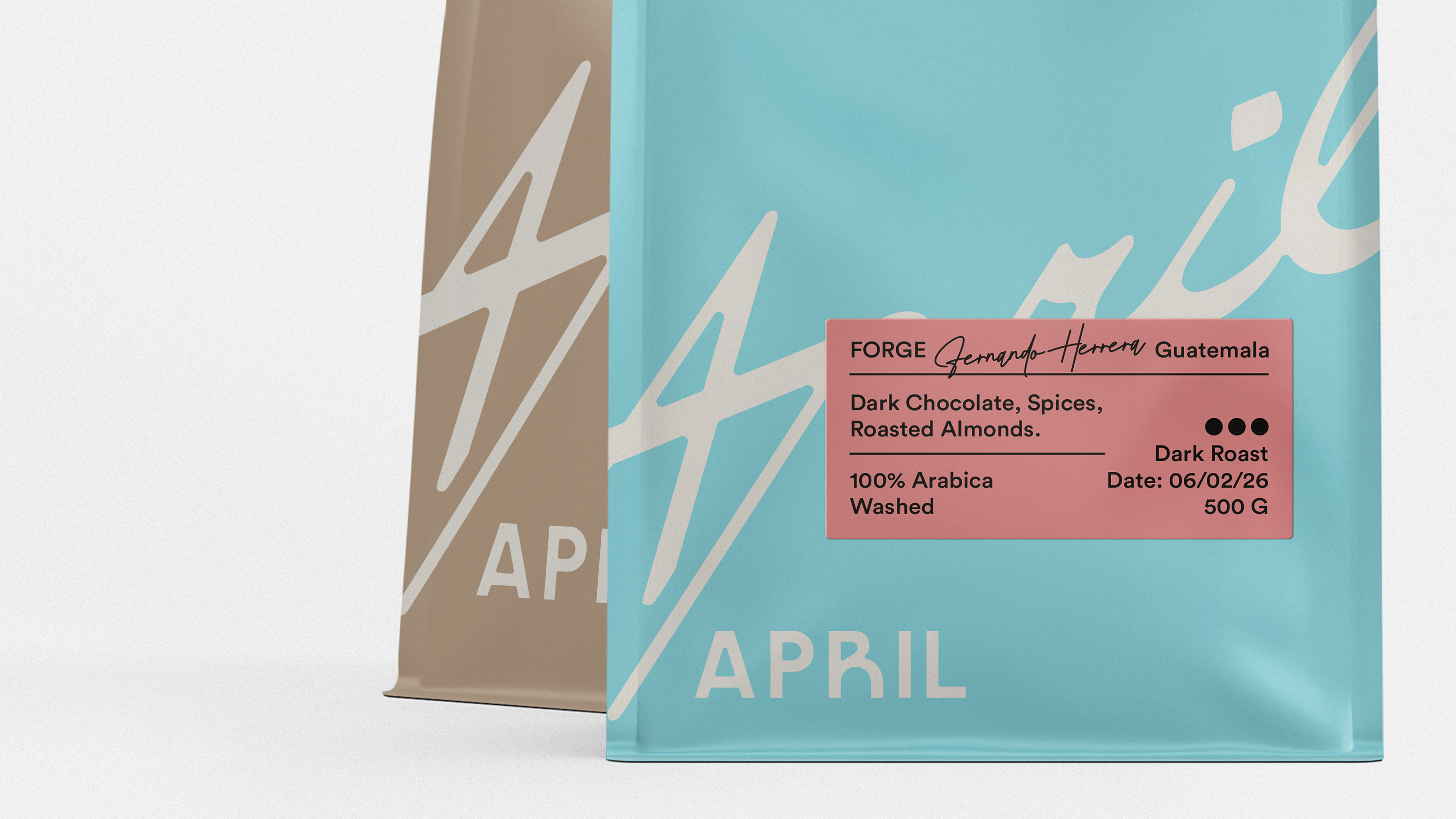
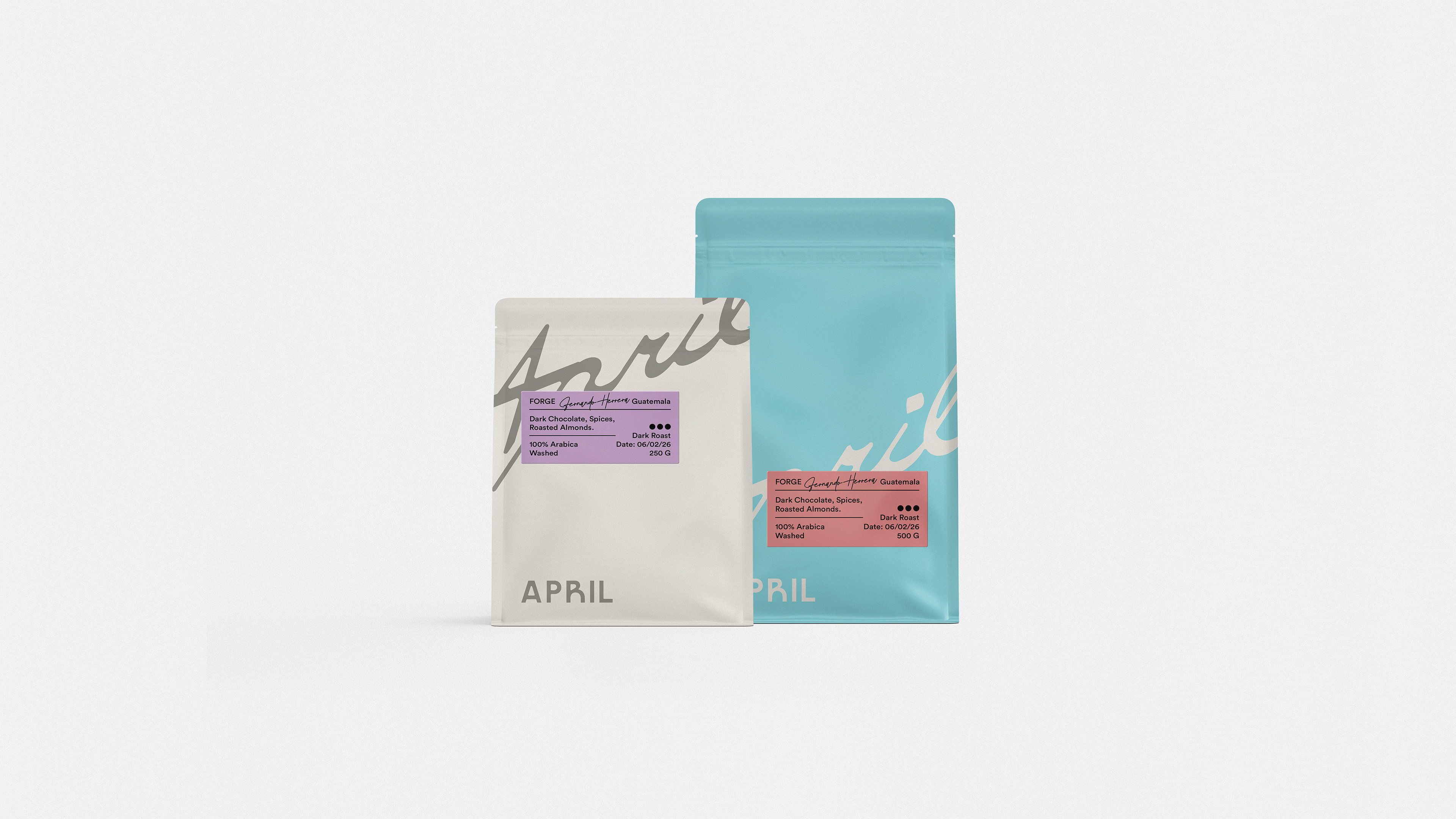
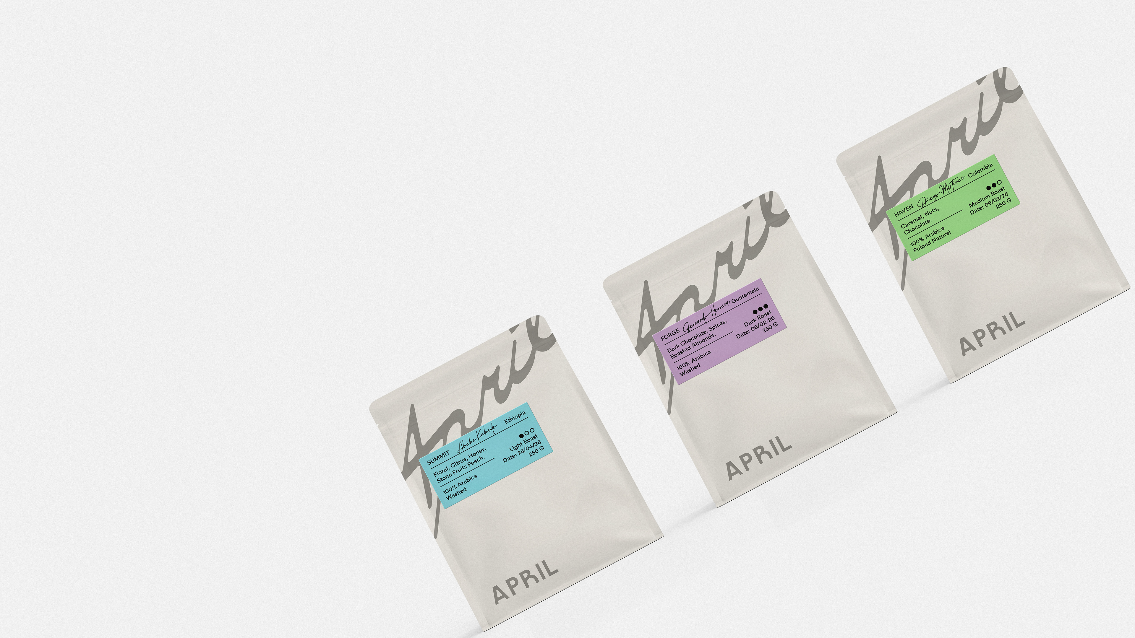
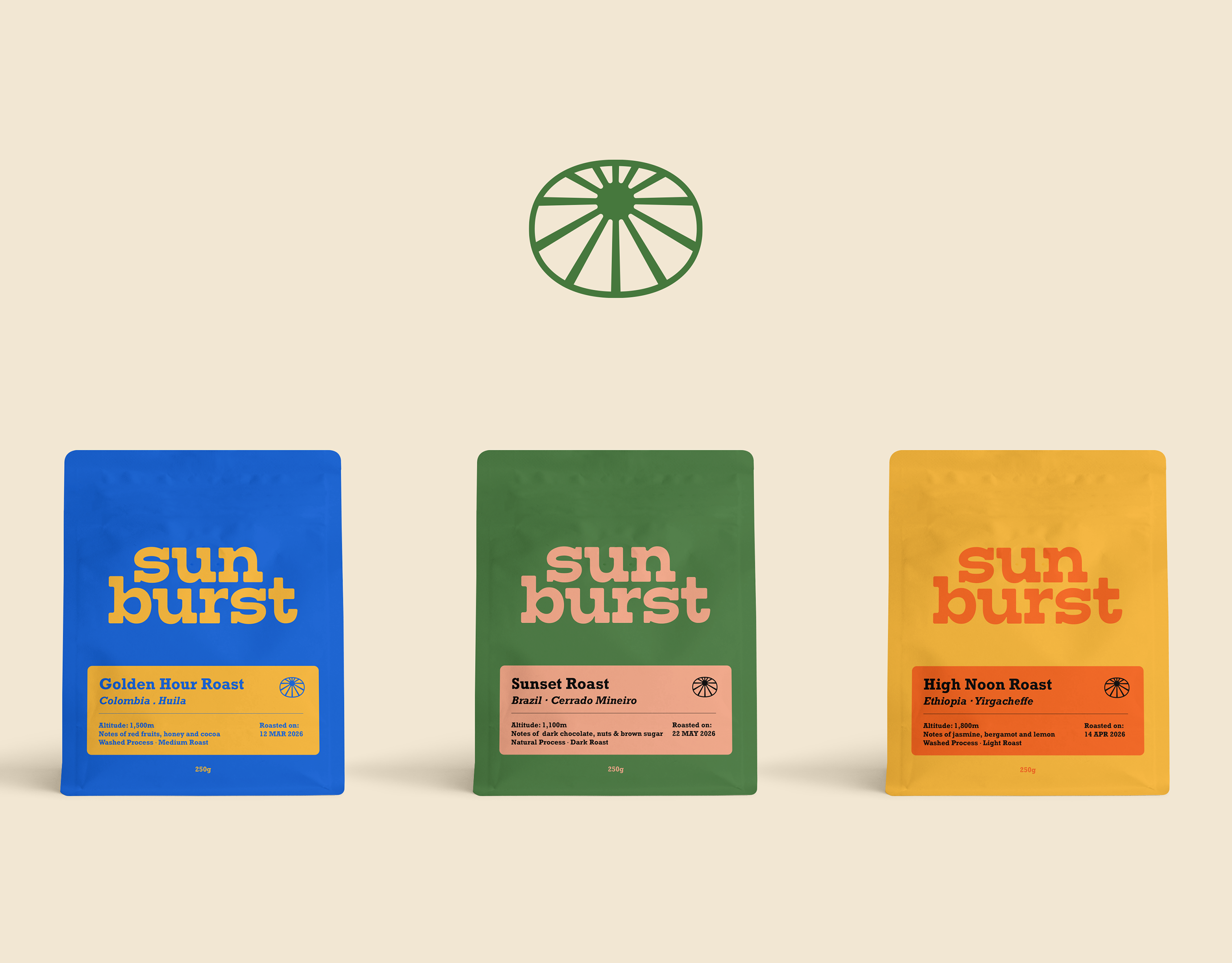
A soft, muted color palette reinforces the brand's calm and contemporary character, while the packaging reflects the same philosophy. Minimal in its composition, each coffee bag features generous negative space and color-coded labels that highlight origin, roast profile, and tasting notes. The result is packaging that feels refined, functional, and honest—allowing the coffee itself to remain the hero while expressing a quiet sense of craftsmanship.