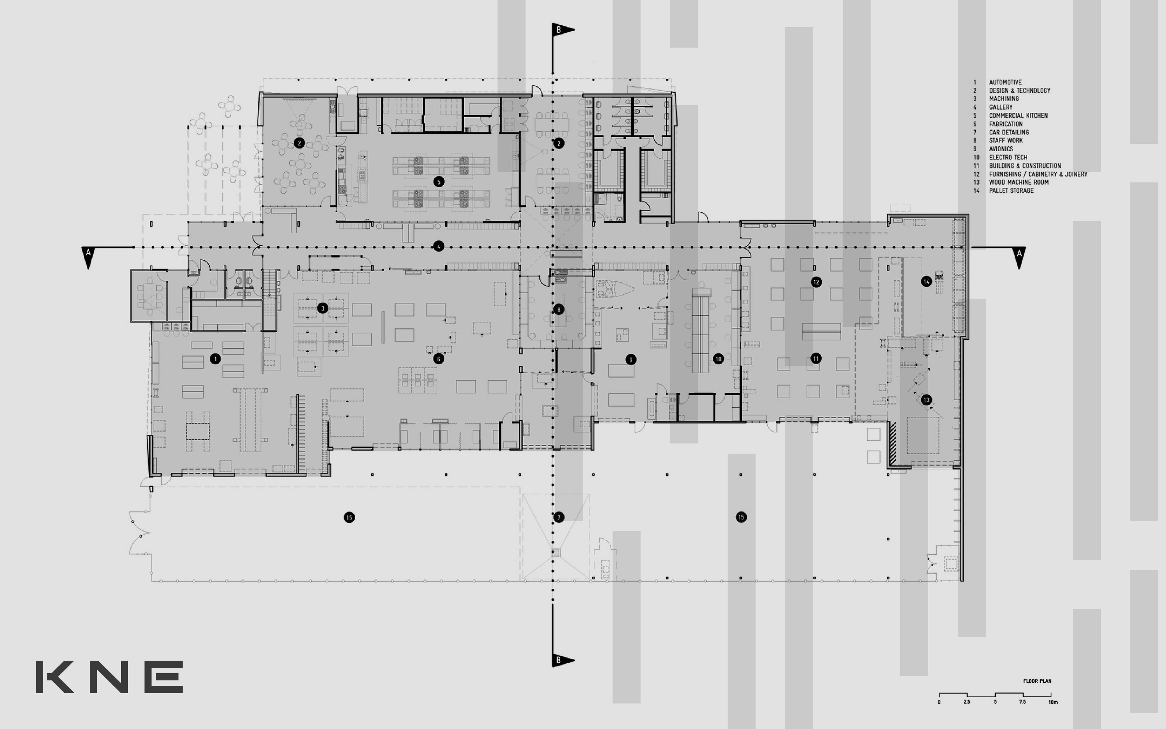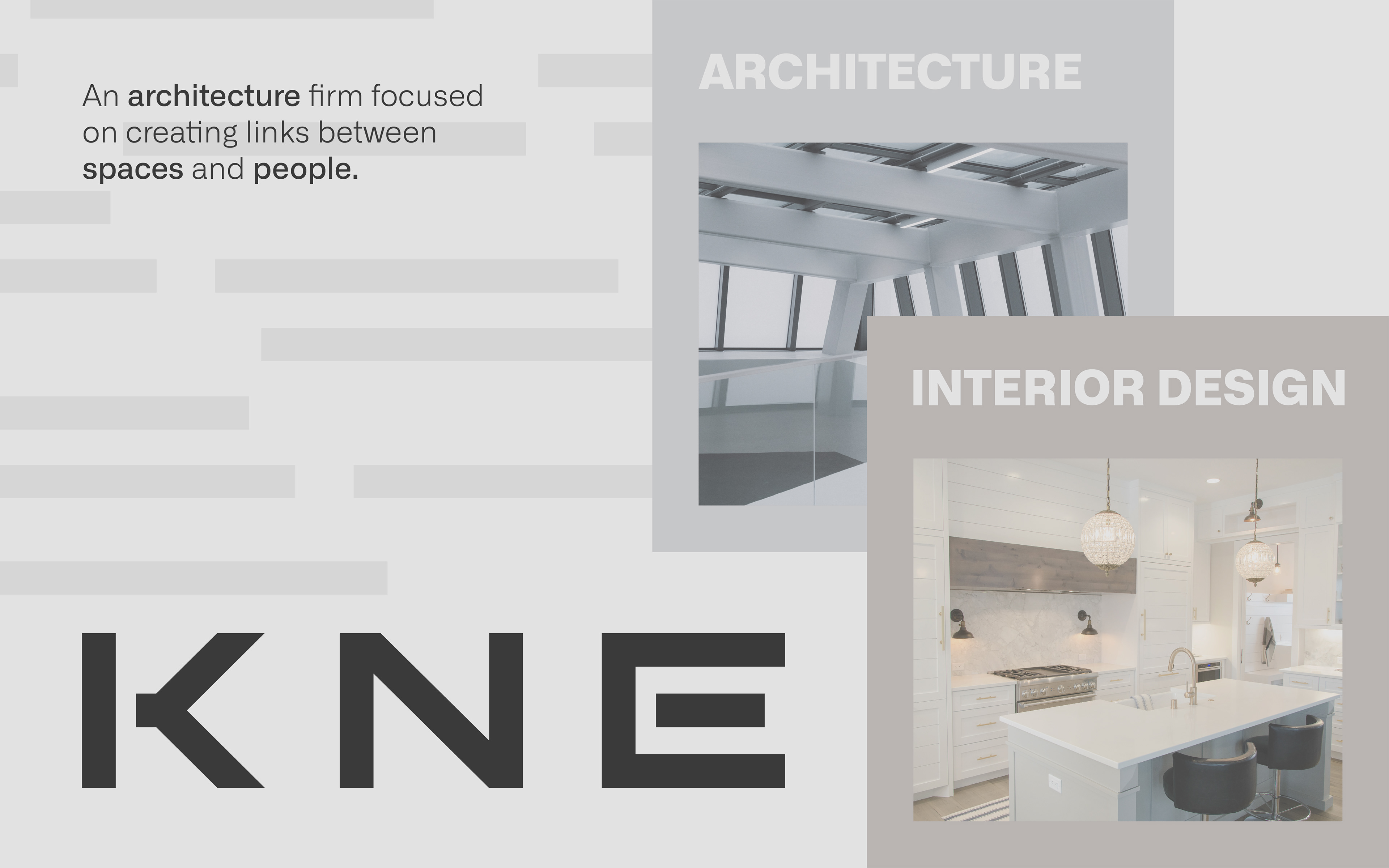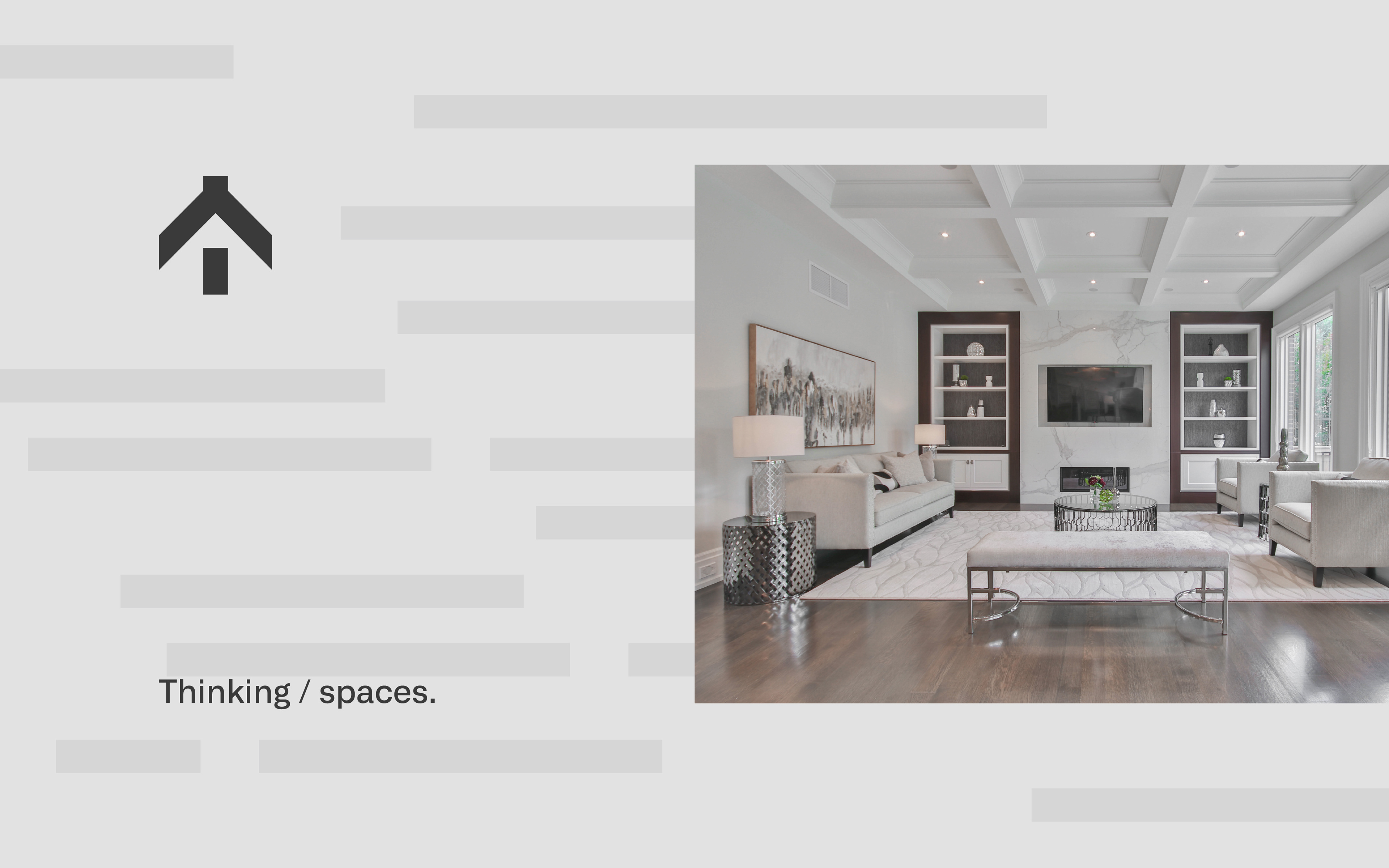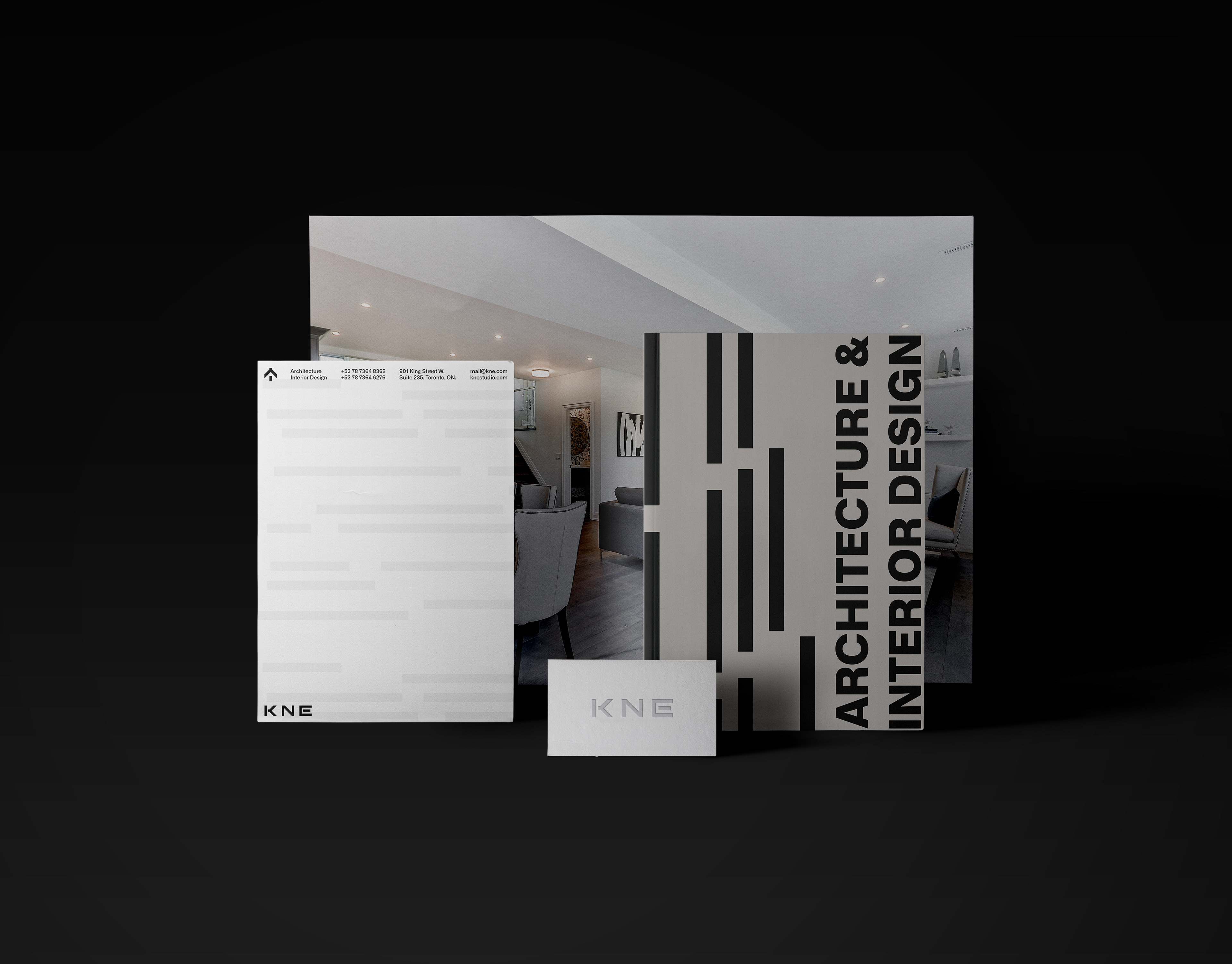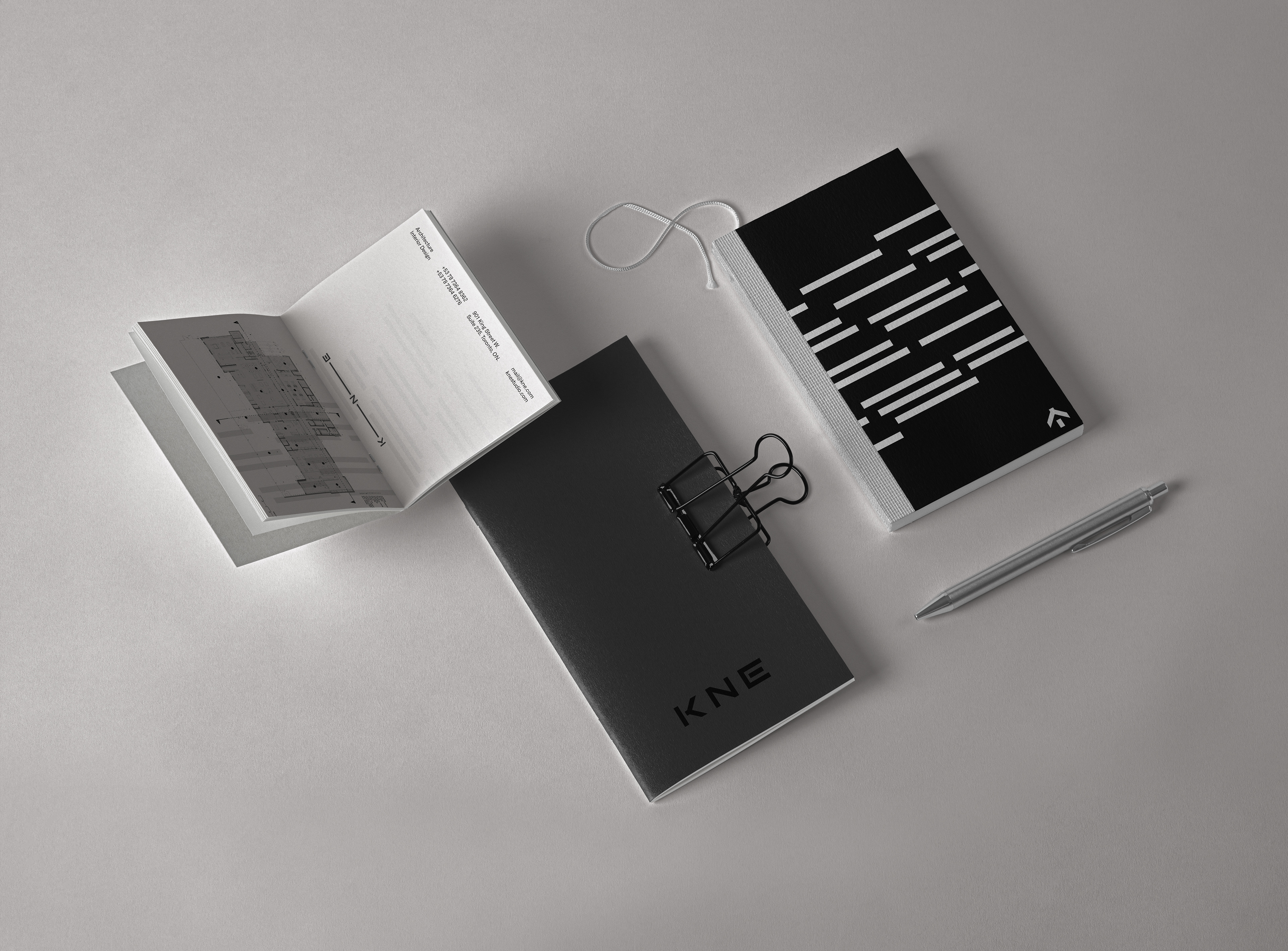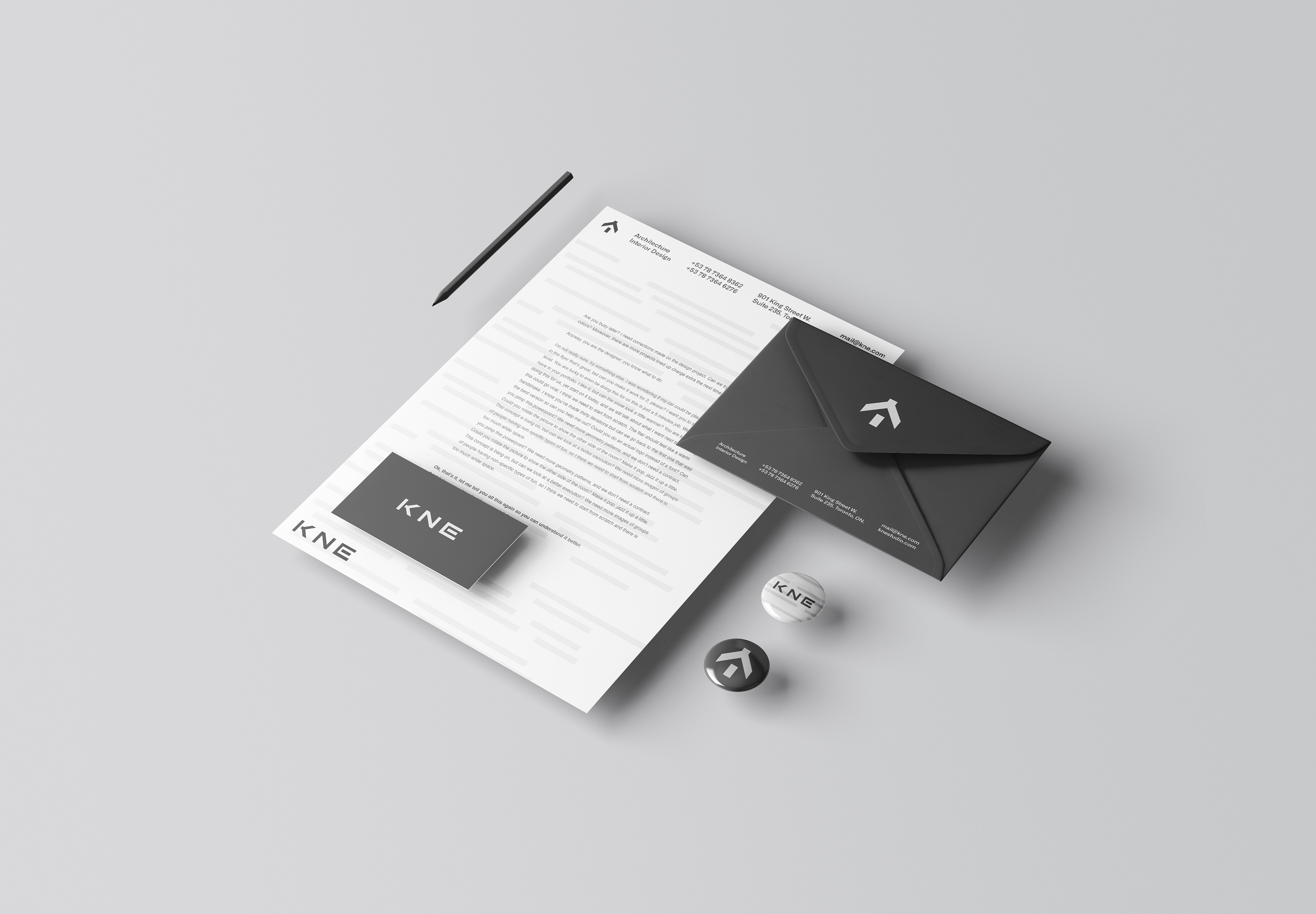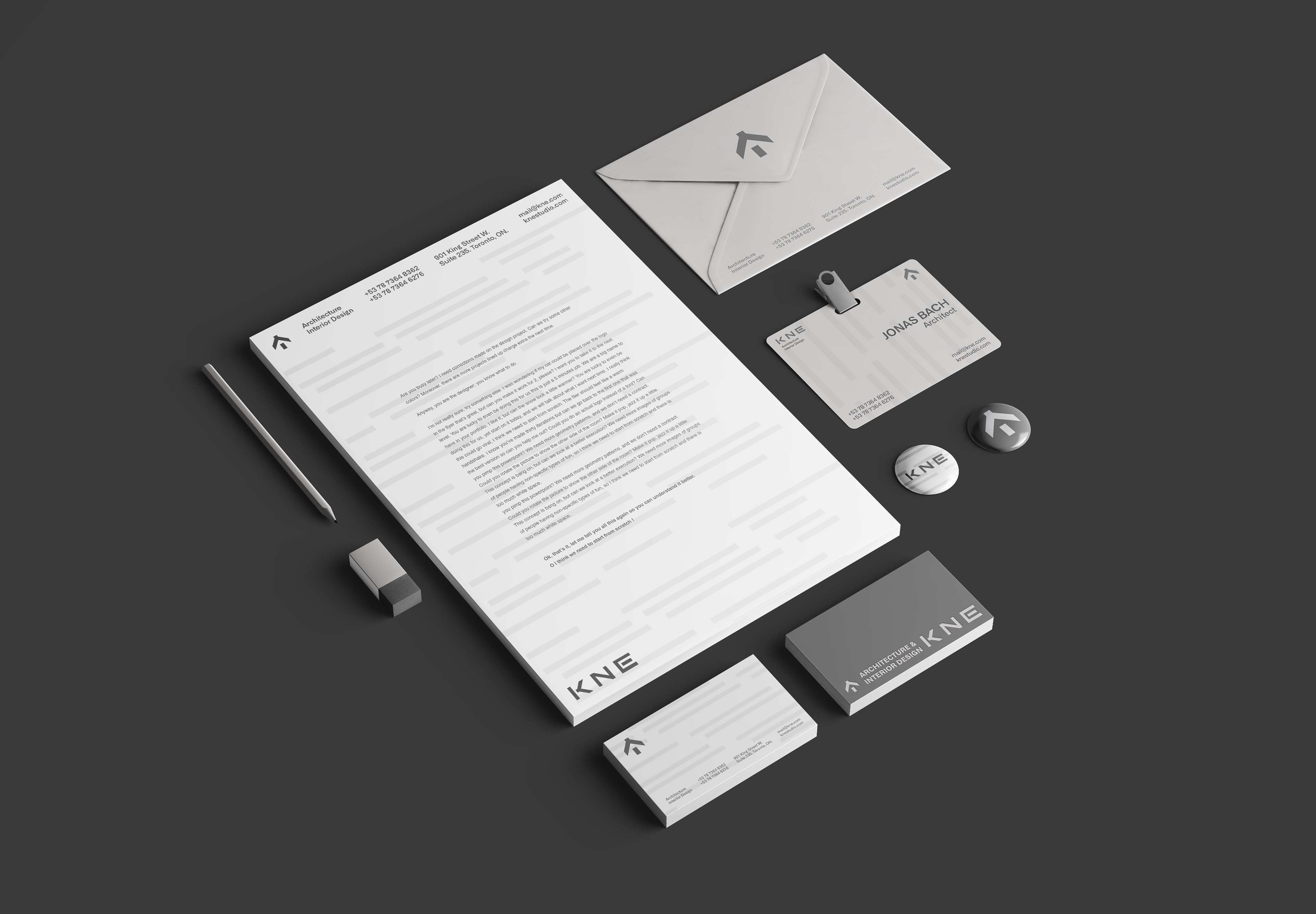

KNE is a group of architects and interior designers with over five years in the market, dedicated to creating lasting and sustainable experiences. The project aimed to reposition the brand to reach a high-end audience, reinforcing its commitment to building timeless and sophisticated spaces.
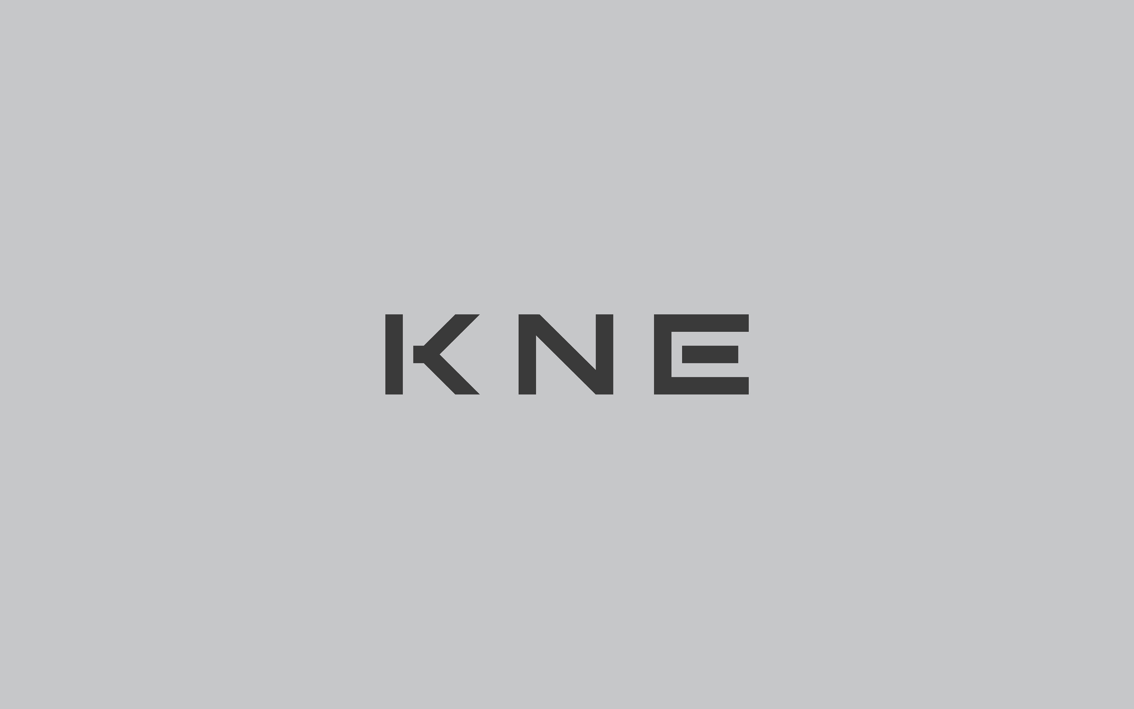
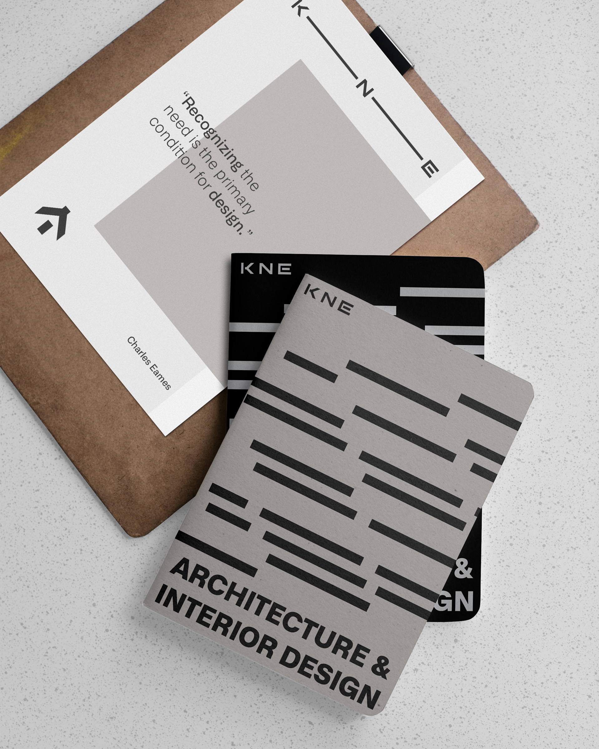
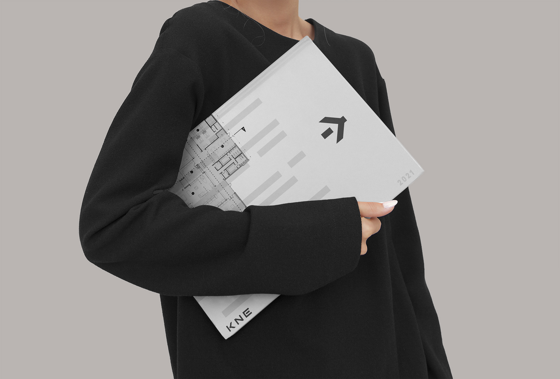
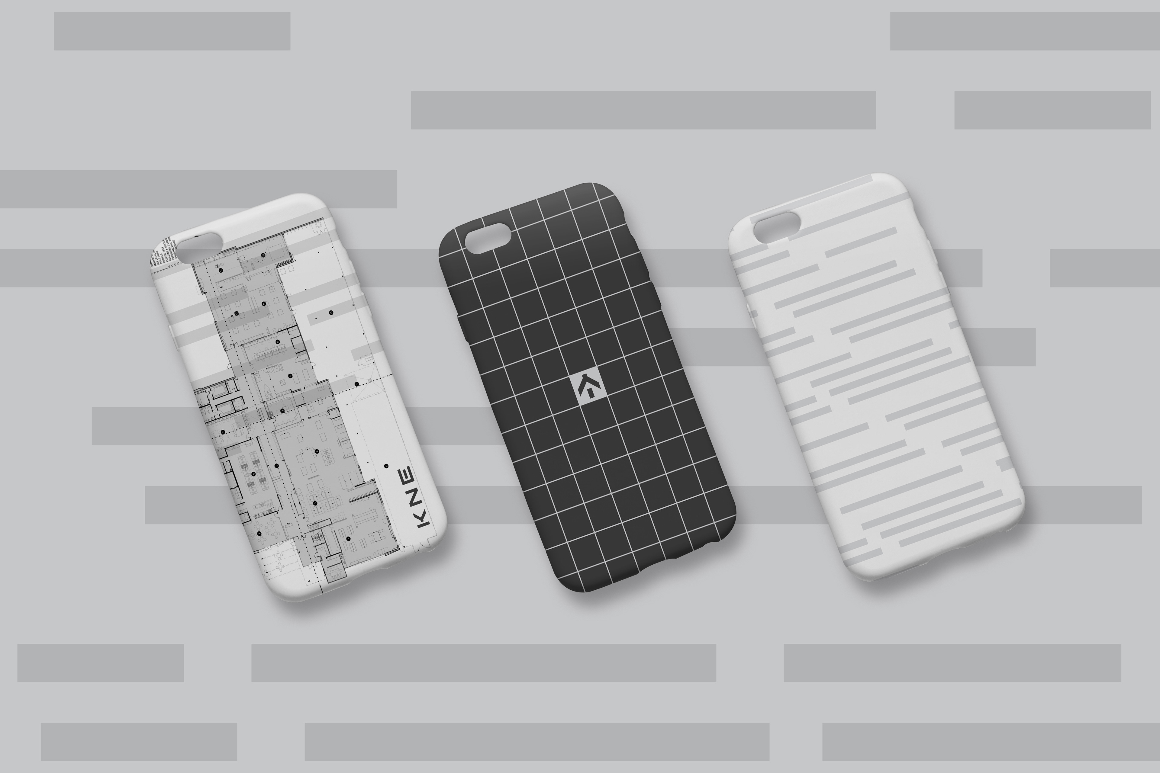
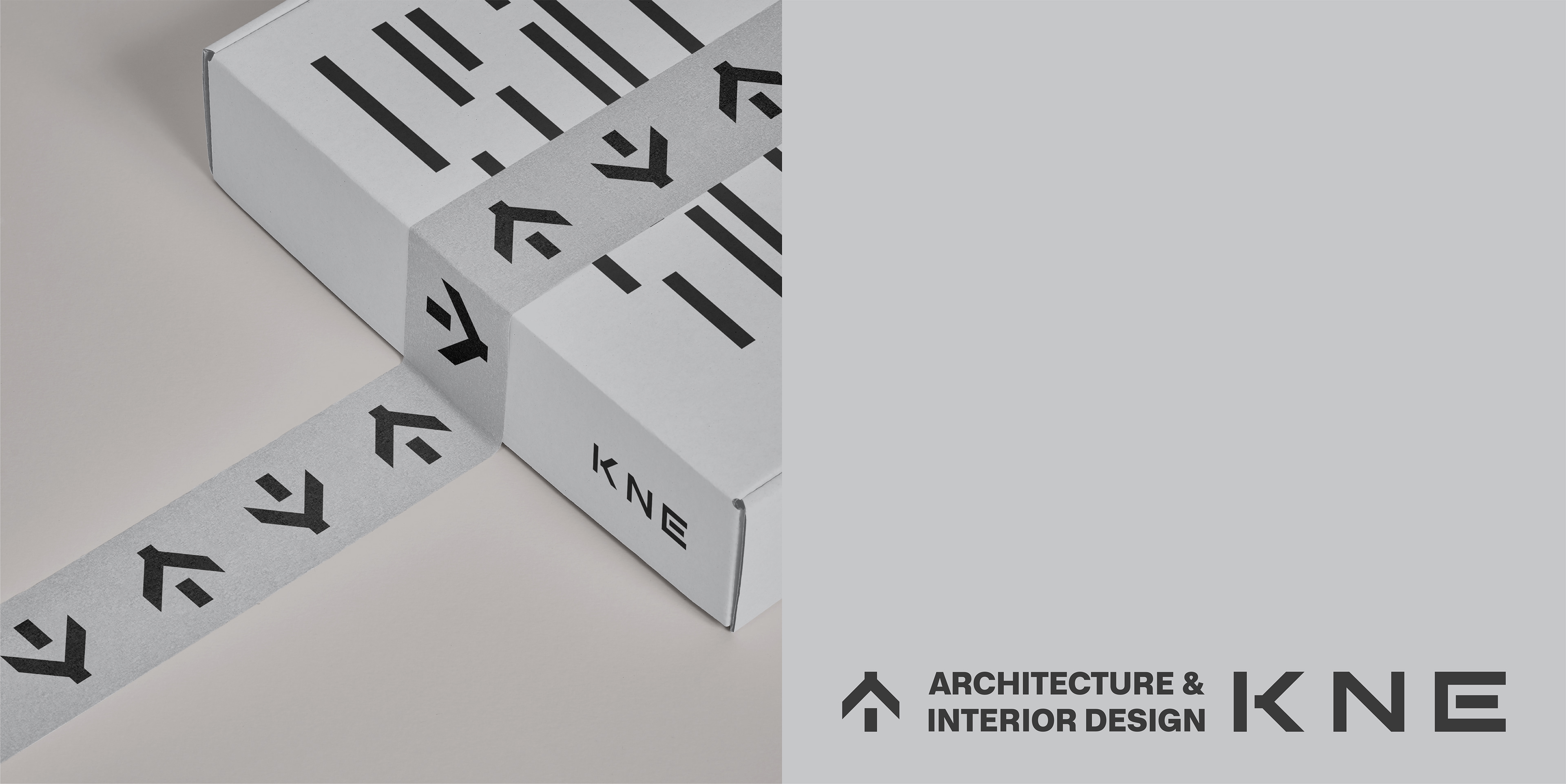
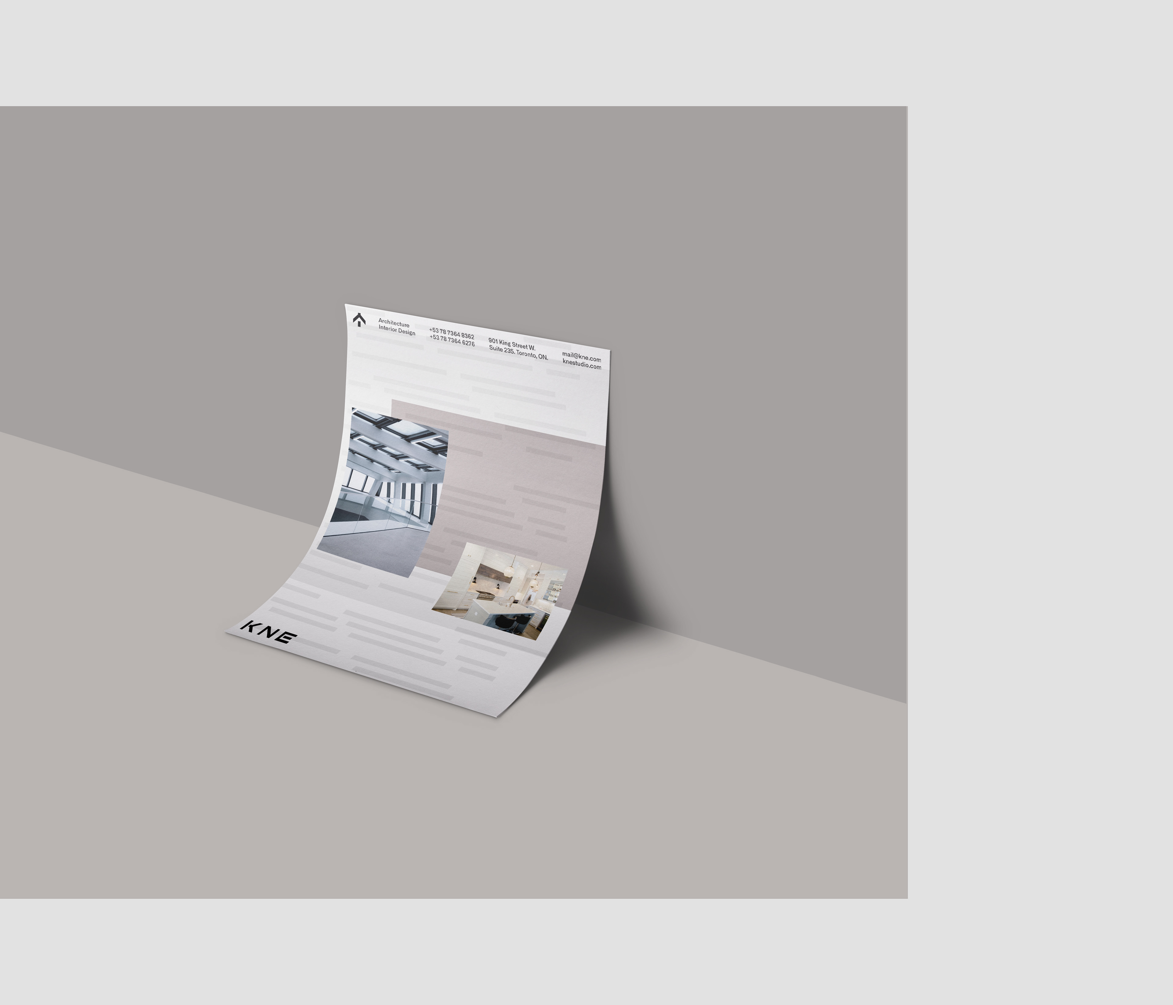
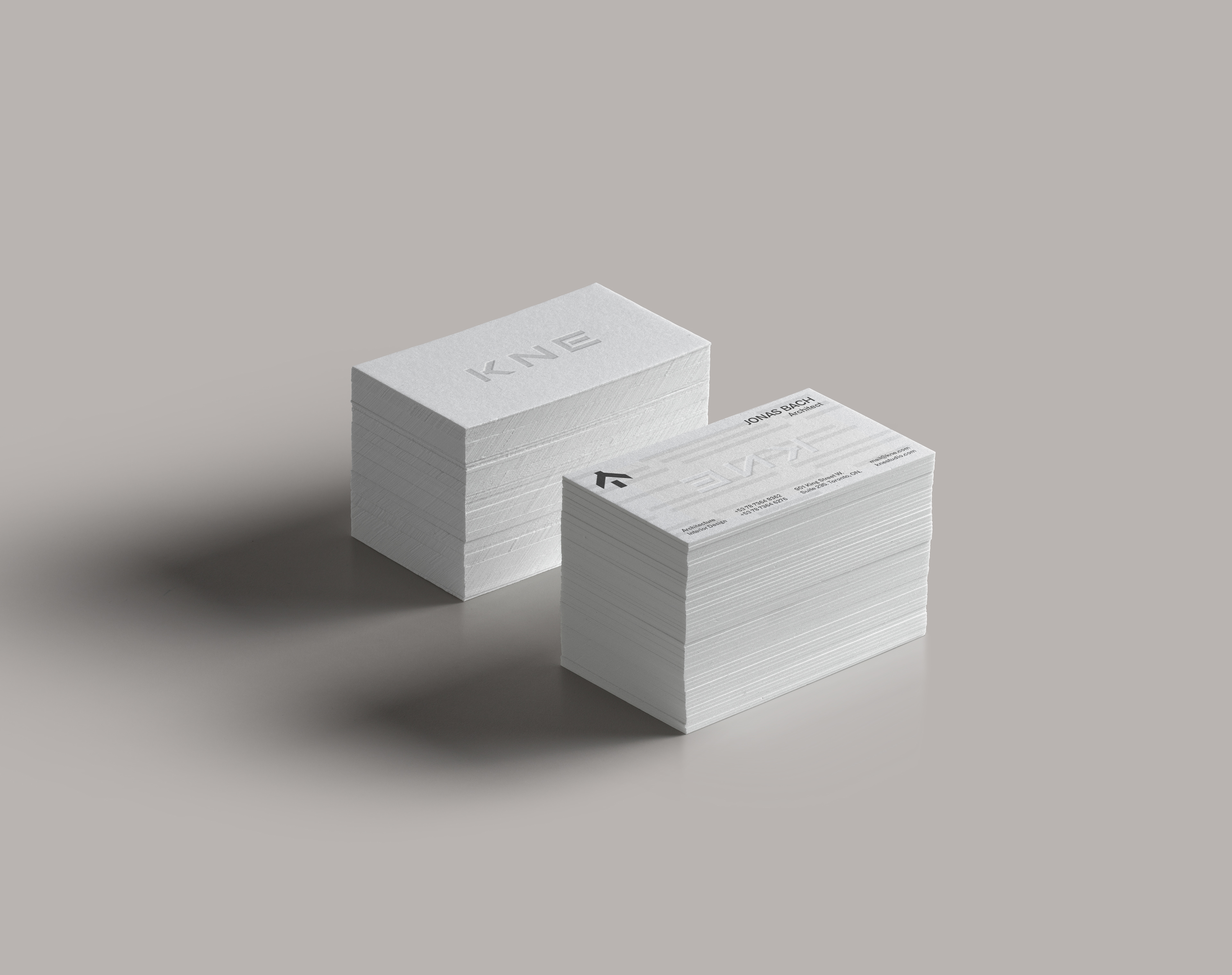
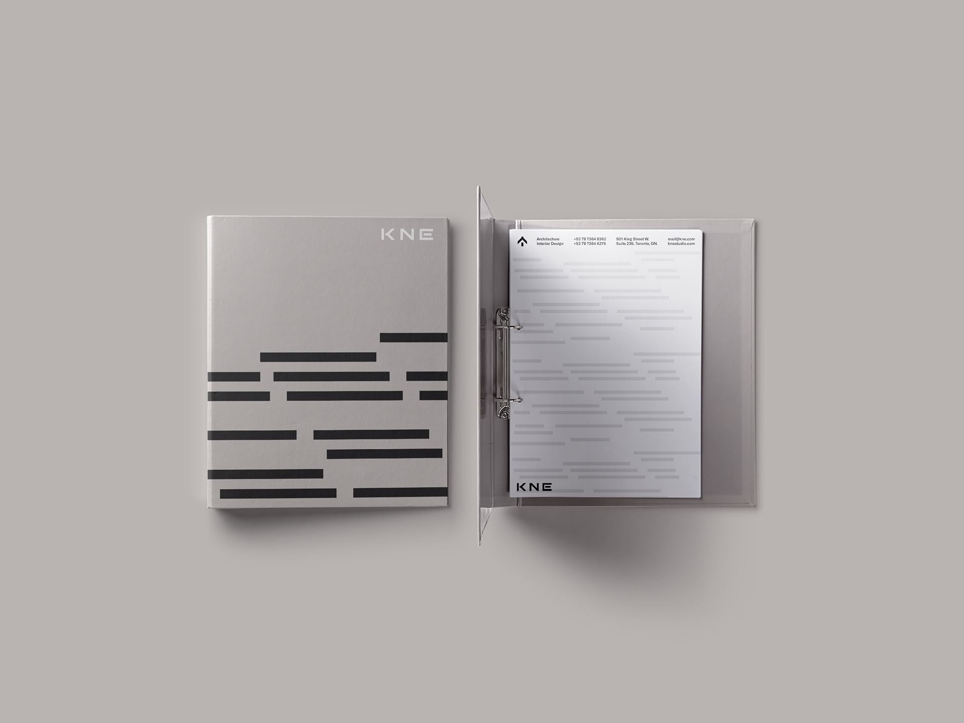
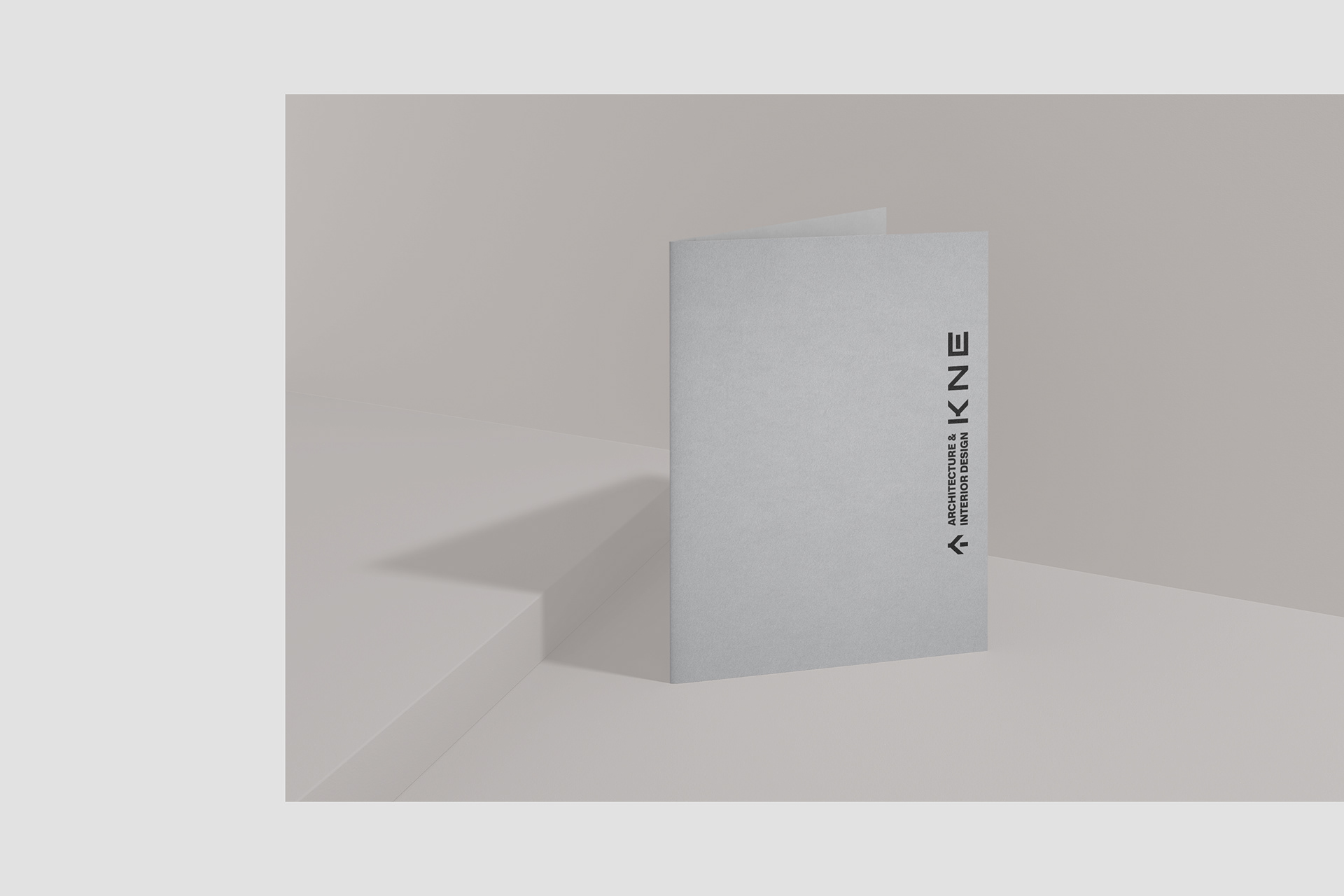
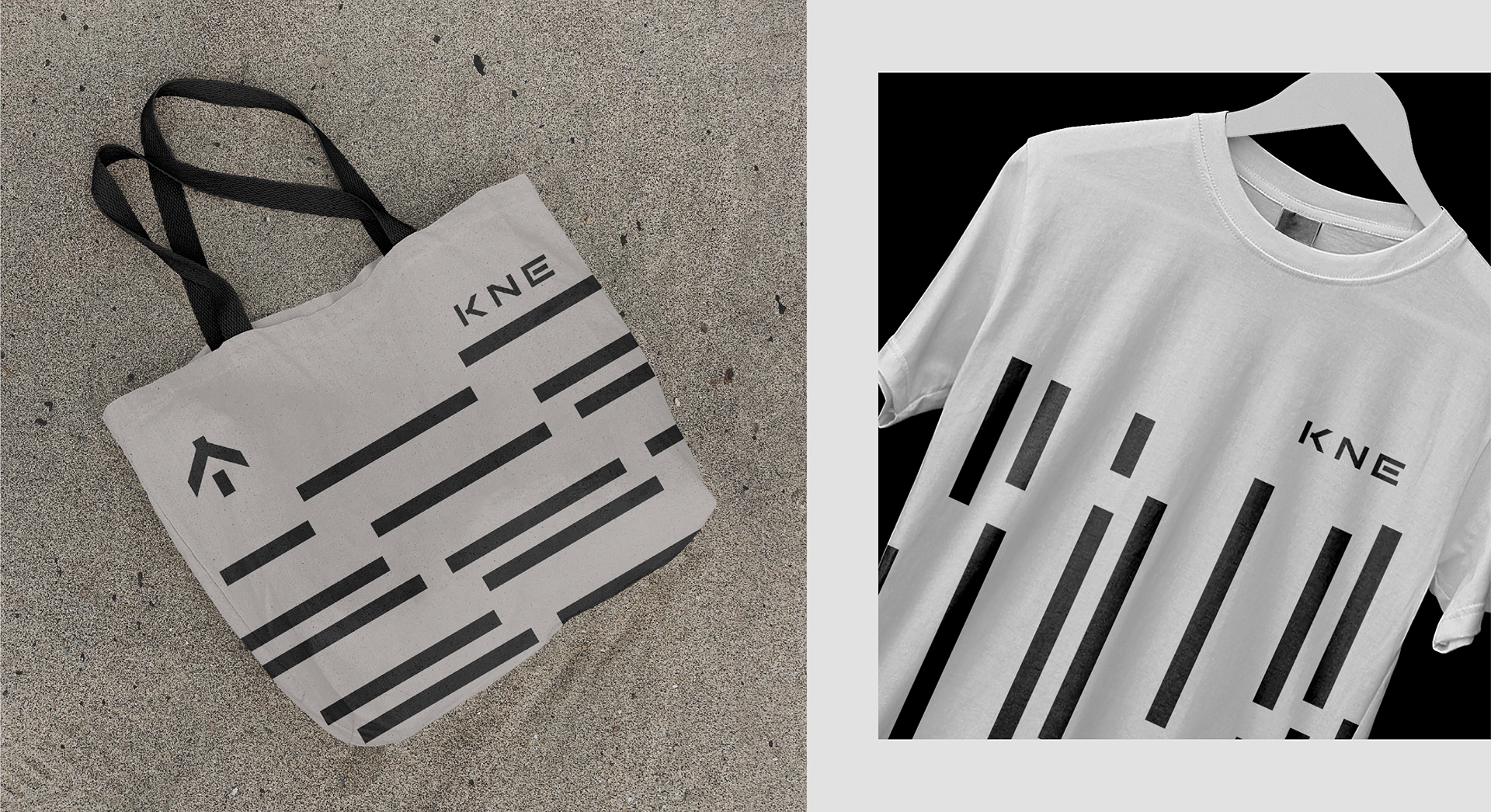
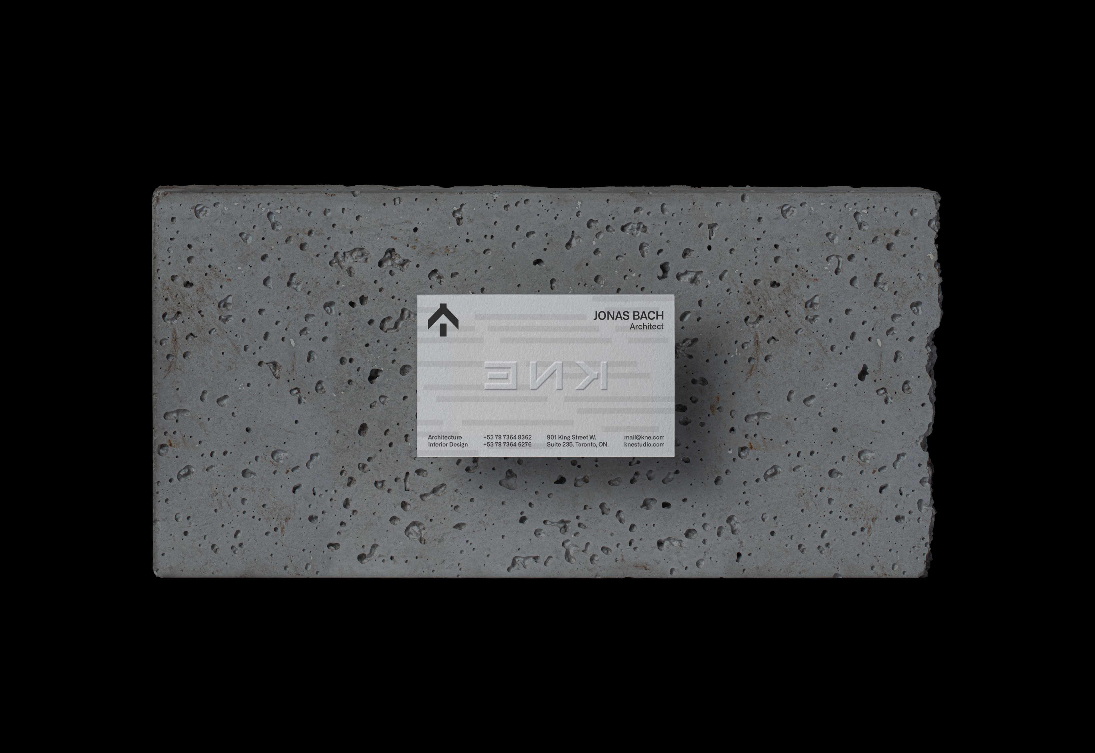
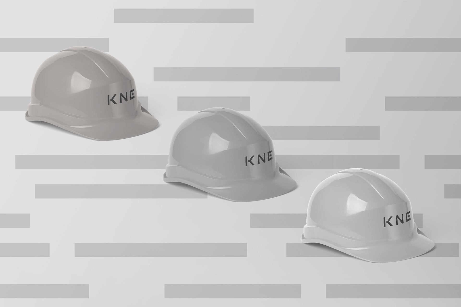
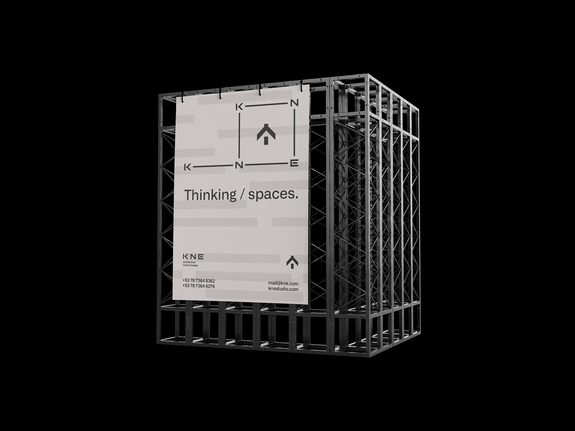
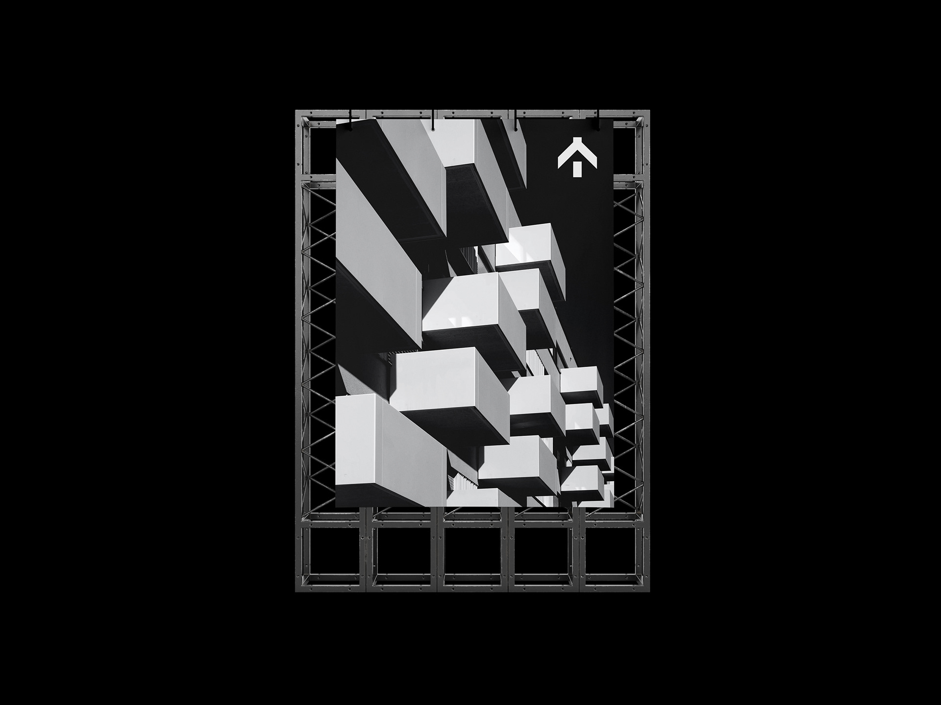
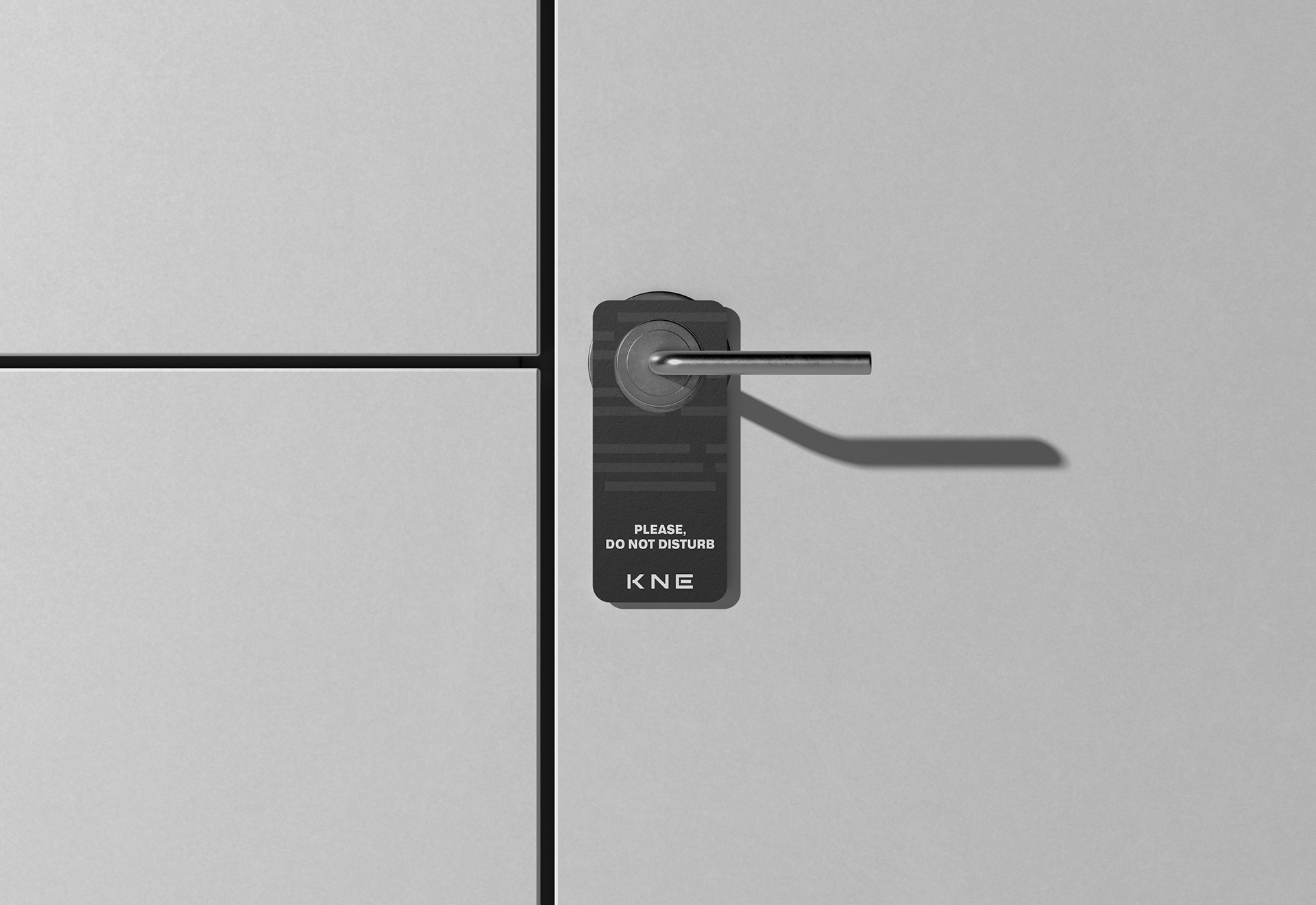
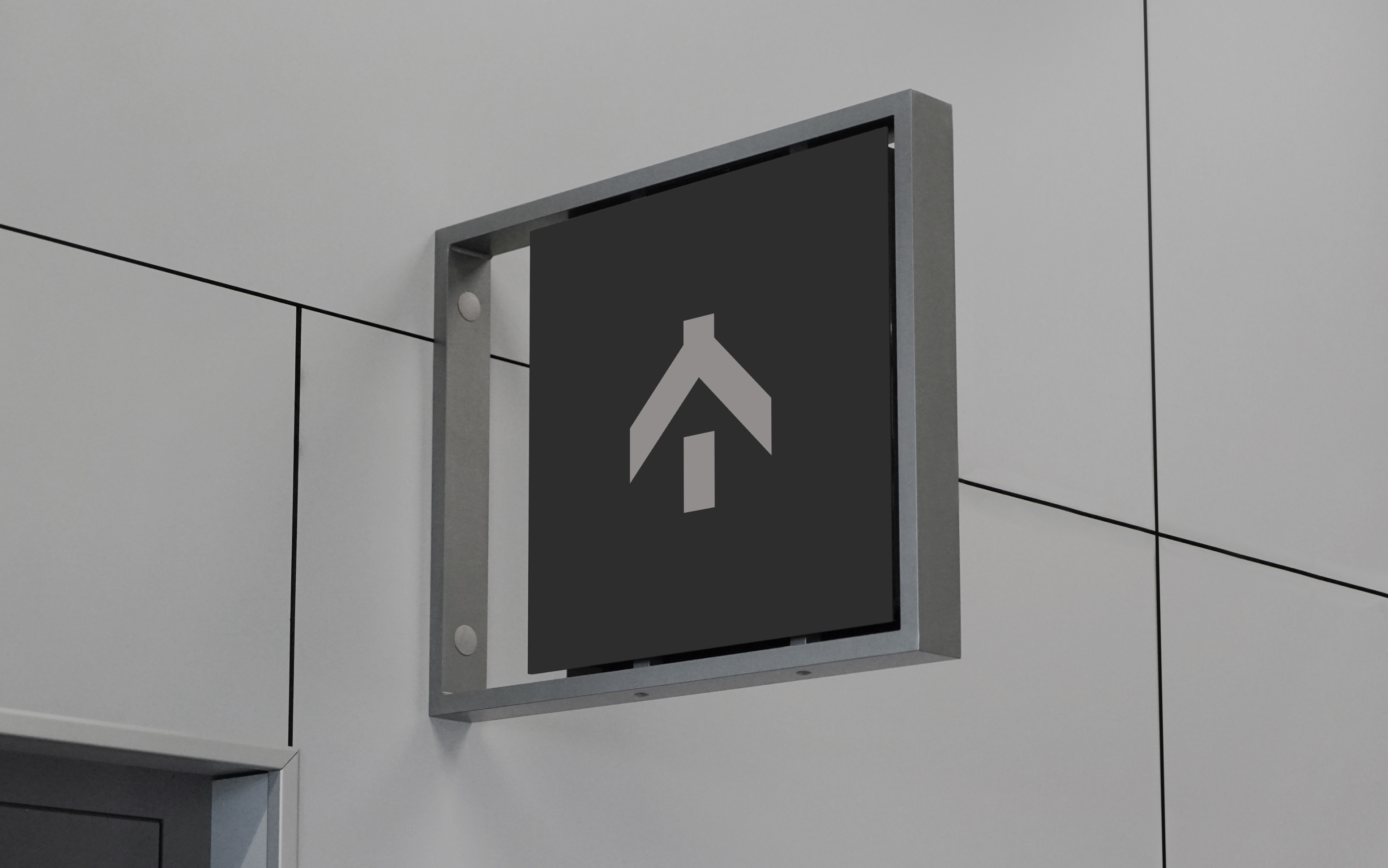
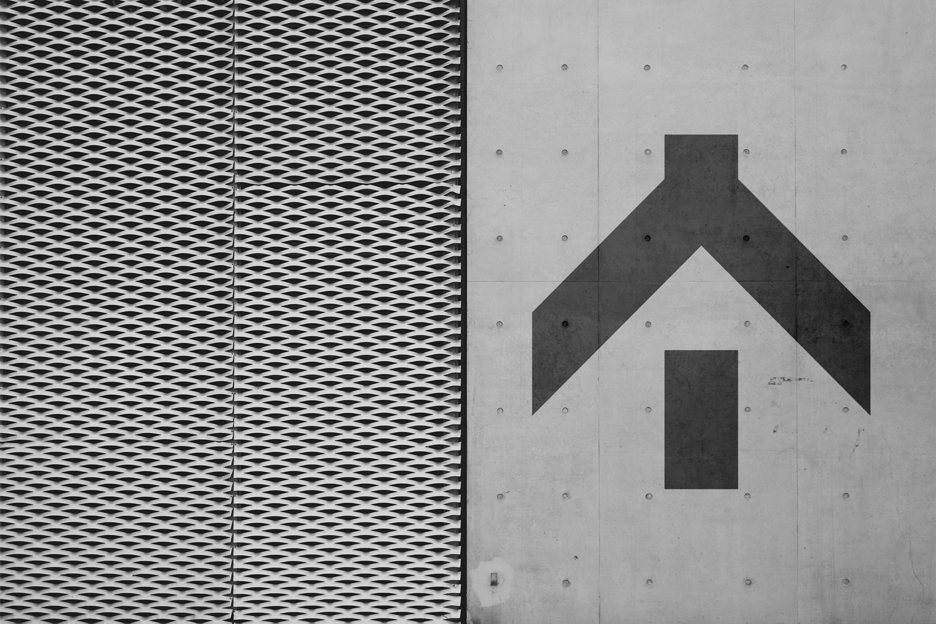
The new visual identity reflects modernity, confidence, and clarity while preserving the brand’s essence. A sober color palette, black, gray, and white, conveys elegance and strength, while the minimalist graphic system ensures precision and consistency.
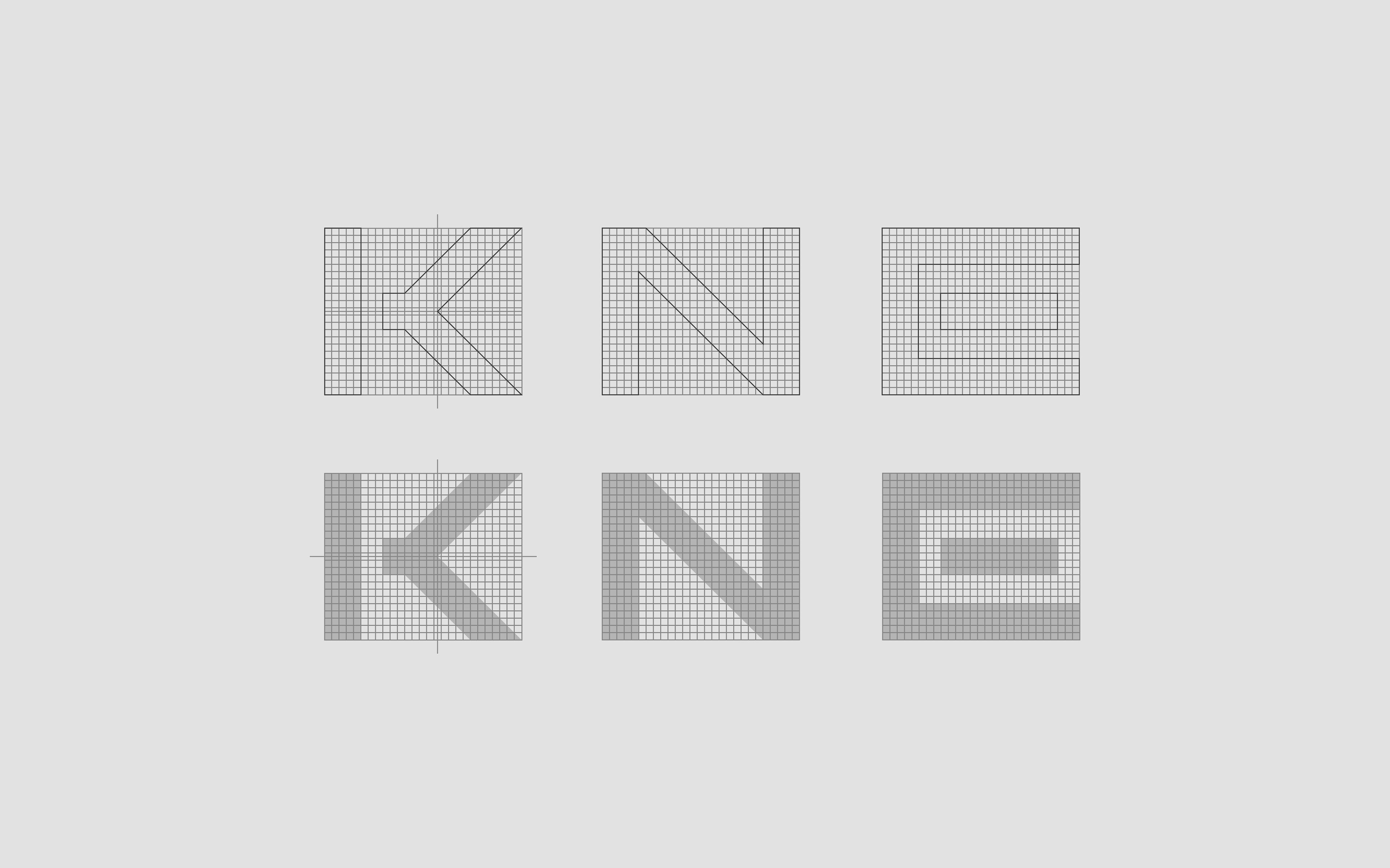
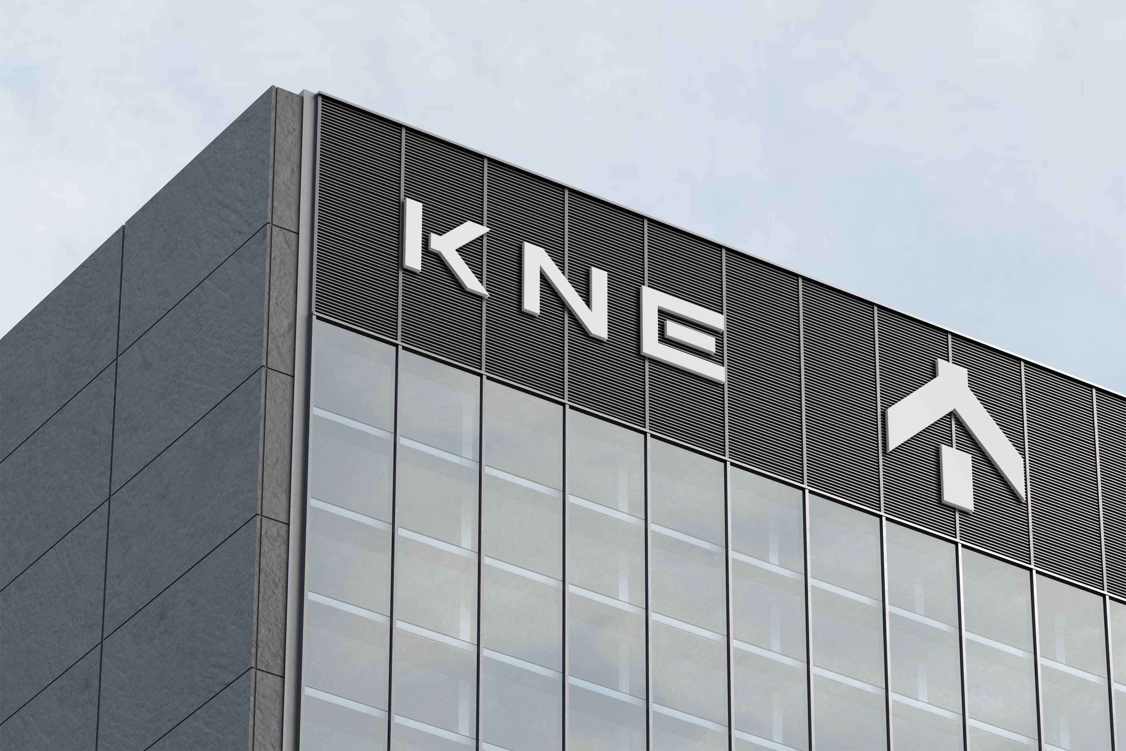
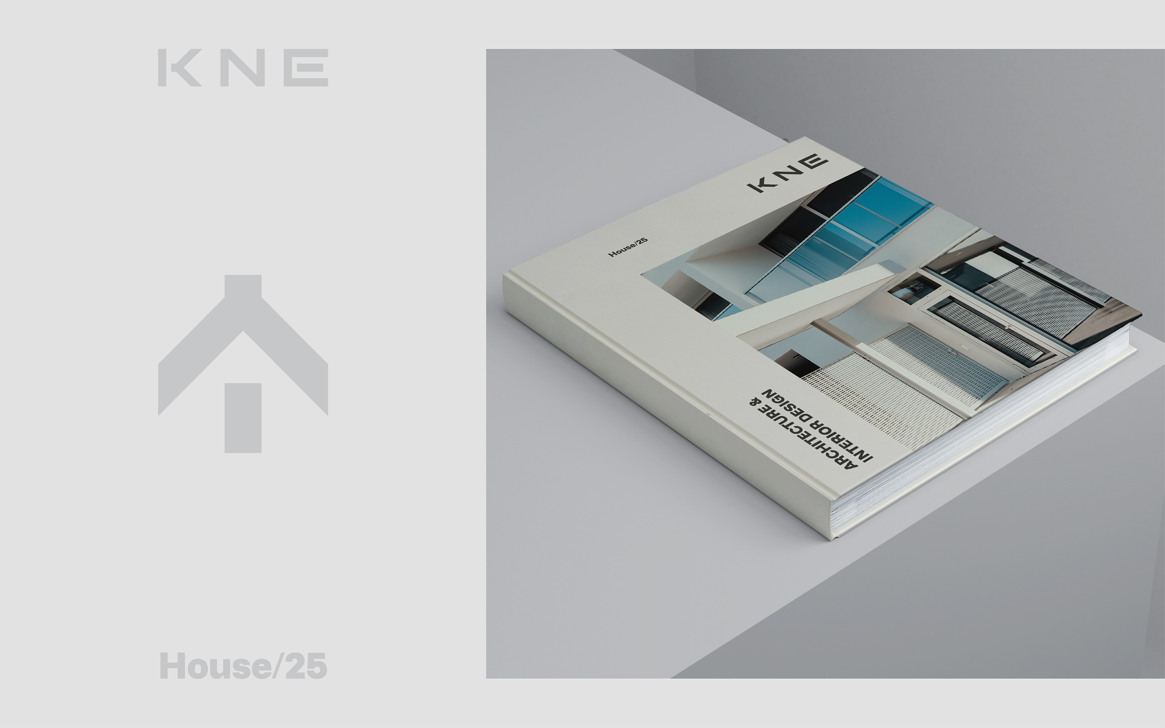
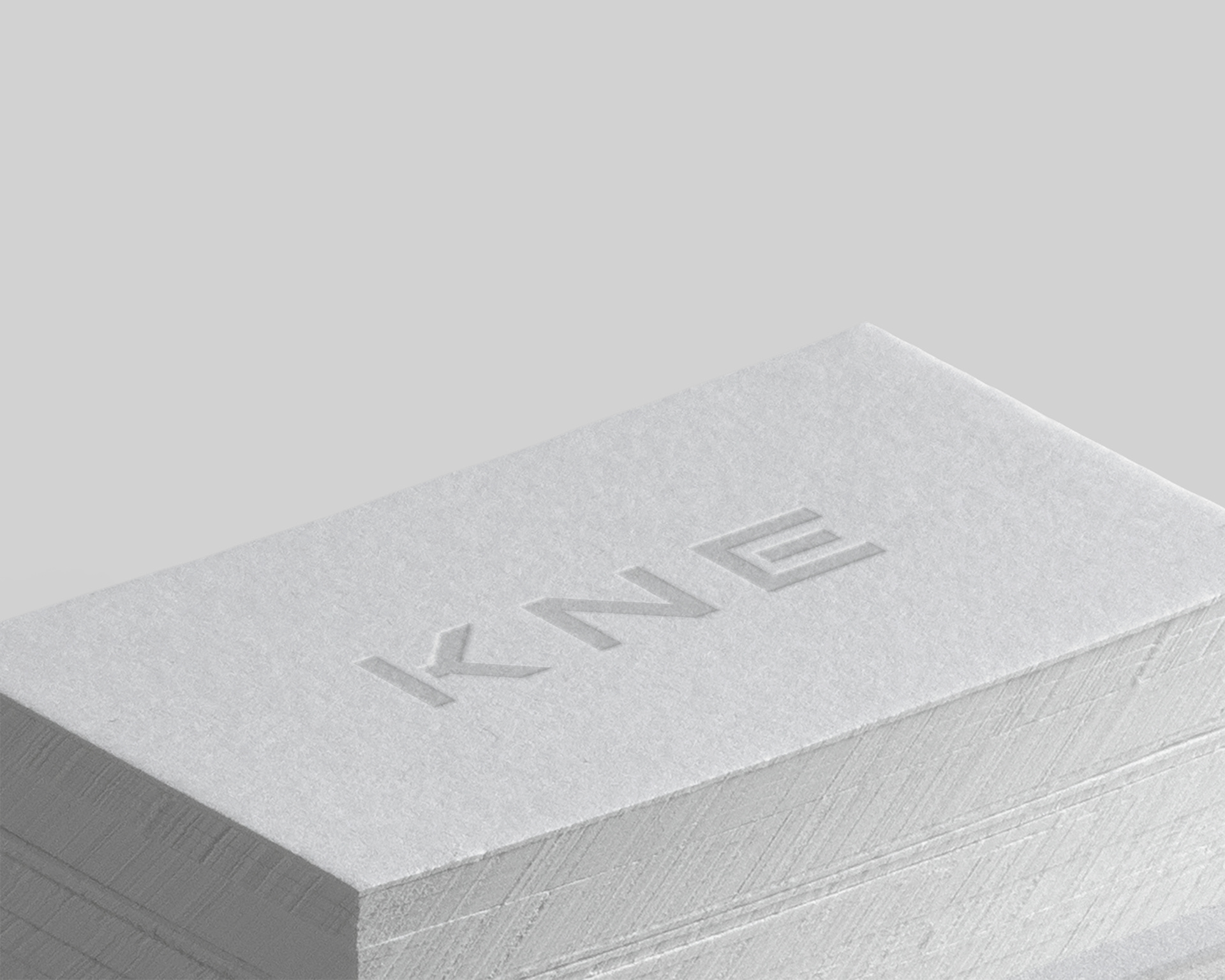
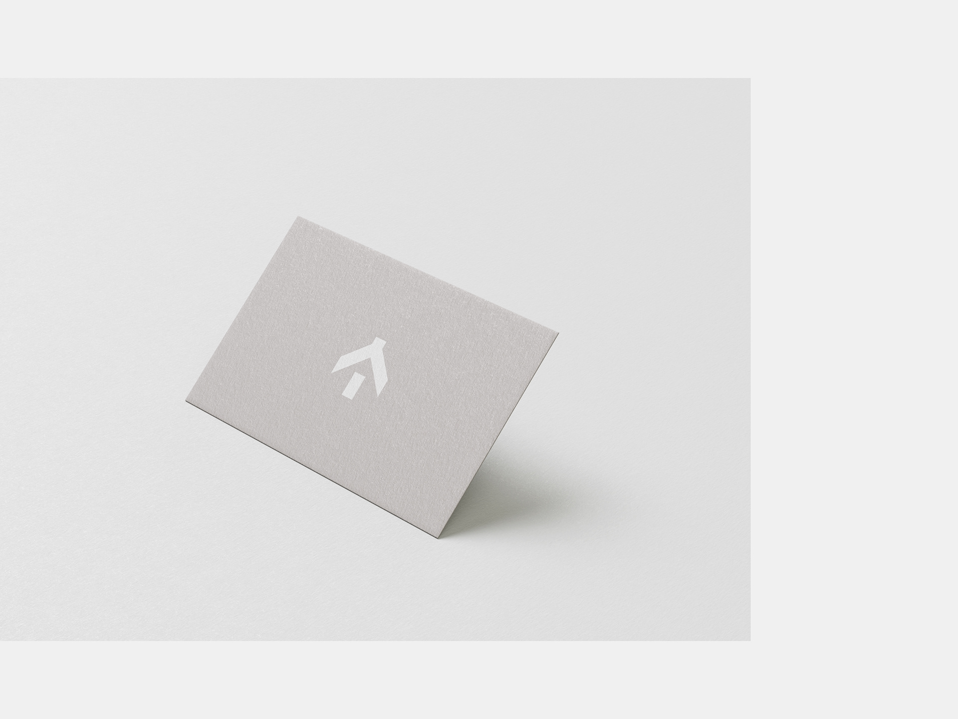
The logo was designed on a modular grid and features a house icon derived from the letter “K” symbolizing the balance between technique and creativity within the brand’s new phase.